Siargao & Surfing: A Love Story Written in Waves

October 21, 2025
Scroll Down

Siargao & Surfing: A Love Story Written in Waves

From secret surf spot to international icon
Siargao is often called the surf capital of the Philippines — and for good reason. With its warm waters, powerful reef breaks, and laid-back vibe, the island has earned its place on the global surf map. But behind the fame lies a deeper story — one of discovery, community, and a wave that changed everything.

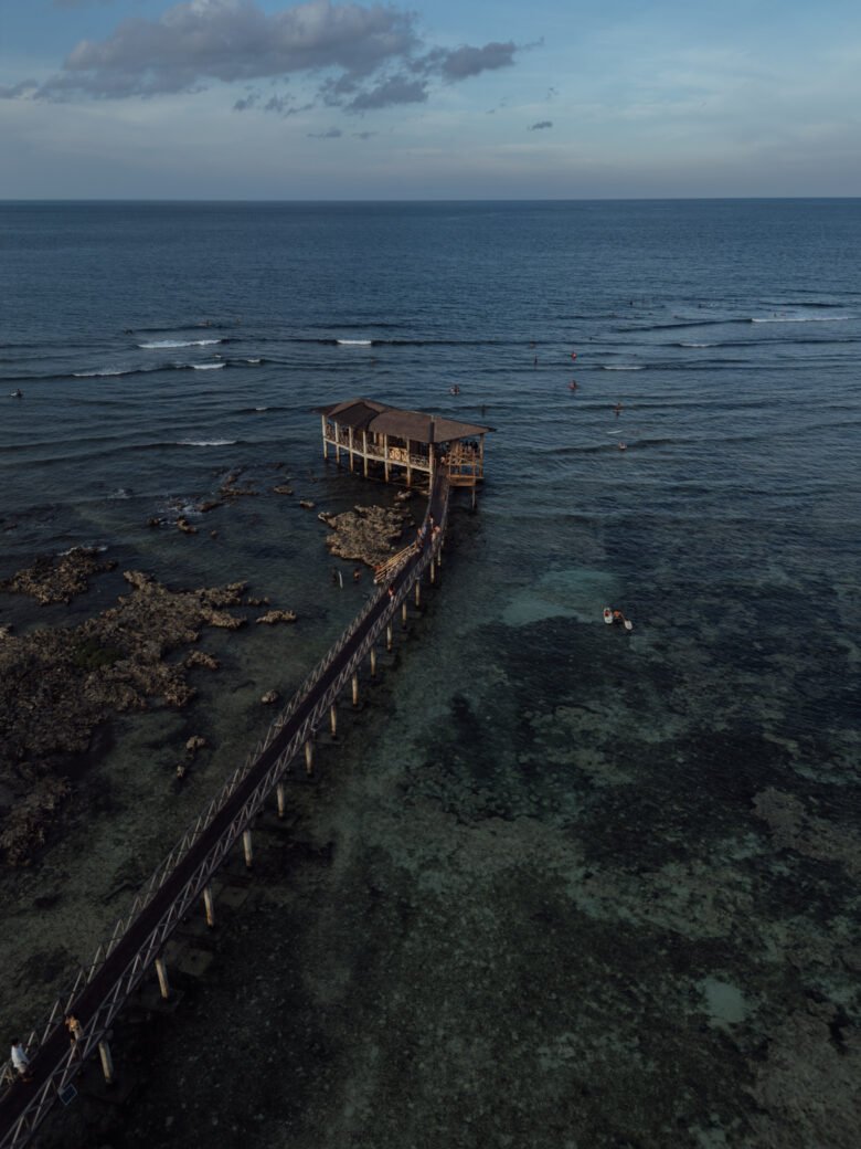
The Discovery of Cloud 9

In the early 1980s, Siargao was almost completely off the tourist radar. A remote island with unpaved roads and no surf scene to speak of. But that changed when a group of traveling surfers from Australia and the U.S. stumbled across a perfect right-hand barrel breaking over shallow reef just outside the village of General Luna.

They named it Cloud 9, inspired by a local chocolate bar — sweet, addictive, and unforgettable. Word spread fast in the tight-knit global surf community. By the 1990s, Siargao was on every surfer’s bucket list.

The Rise of Surf Culture & International Competition

To celebrate its growing surf scene and put Siargao on the world stage, the first Siargao International Surfing Cup was launched in 1994. Held annually at Cloud 9, the competition has since grown into one of Asia’s most prestigious surf events — drawing top professional surfers from around the globe.

The competition is now part of the World Surf League (WSL) Qualifying Series, and it’s not just about winning — it’s a celebration of surf, culture, and the Siargaonon spirit. Locals and tourists gather to watch the action, cheer from the boardwalk, and dance at night under the palm trees.

Surf Culture Today

Siargao is no longer a secret — but it’s managed to keep its heart. Surfing isn’t just a sport here; it’s a way of life. You’ll see kids carrying boards to school, sunrise surf check rituals, and surf instructors sharing their knowledge with passion and pride.

Beyond Cloud 9, the island offers dozens of lesser-known breaks like Stimpy’s, Rock Island, Jacking Horse, and Pacifico — each with their own vibe and level. Whether you're a beginner catching your first wave or a pro chasing barrels, Siargao has something for you.

More Than Waves

Surfing brought global attention to Siargao, but the island has given back just as much. It has become a hub for eco-conscious travel, wellness, creativity, and slow living. The surf scene helped shape the identity of Siargao — open, free, raw, and deeply connected to nature.

Ready to Ride?

Whether you’re coming for the first time or returning for the fifth, surfing in Siargao is more than just a sport — it’s a ritual, a challenge, and a gift.

At Mémé Villa, we offer tailored surf experiences with trusted local instructors and access to the best breaks depending on your level and the season. It’s not just about standing up on a board — it’s about connecting to the island through its waves.

Leave a Reply

Your email address will not be published. Required fields are marked *

Close
.main-navigation a { color: #ffffff !important; } .site-header, .site-header-main, .site-header:before, .site-header:after { border-bottom: none !important; box-shadow: none !important; } /* Also remove any divider line from pseudo elements */ .site-header::before, .site-header::after, .site-header-main::before, .site-header-main::after { display: none !important; } /* ===== MC4WP Newsletter Popup Toast ===== */ /* Hide the inline success/error response by default */ .mc4wp-response { display: none !important; } /* Popup overlay backdrop */ #mc4wp-popup-overlay { display: none; position: fixed; top: 0; left: 0; width: 100%; height: 100%; background: rgba(0, 0, 0, 0.5); z-index: 999998; justify-content: center; align-items: center; } #mc4wp-popup-overlay.active { display: flex; } /* Popup box */ #mc4wp-popup-box { background: #3b5248; color: #ffffff; padding: 40px 50px; border-radius: 4px; text-align: center; max-width: 440px; width: 90%; position: relative; box-shadow: 0 20px 60px rgba(0,0,0,0.4); animation: mc4wpPopupIn 0.3s ease; } @keyframes mc4wpPopupIn { from { opacity: 0; transform: scale(0.85); } to { opacity: 1; transform: scale(1); } } /* Icon at top */ #mc4wp-popup-box .mc4wp-popup-icon { font-size: 48px; margin-bottom: 16px; display: block; line-height: 1; } /* Title */ #mc4wp-popup-box .mc4wp-popup-title { font-size: 22px; font-weight: 600; letter-spacing: 0.05em; margin-bottom: 12px; font-family: inherit; text-transform: uppercase; } /* Message text */ #mc4wp-popup-box .mc4wp-popup-message { font-size: 14px; line-height: 1.7; opacity: 0.85; margin-bottom: 24px; } /* Close button */ #mc4wp-popup-box .mc4wp-popup-close { background: rgba(255,255,255,0.15); color: #ffffff; border: 1px solid rgba(255,255,255,0.3); padding: 10px 28px; cursor: pointer; font-size: 13px; letter-spacing: 0.1em; text-transform: uppercase; border-radius: 2px; transition: background 0.2s; } #mc4wp-popup-box .mc4wp-popup-close:hover { background: rgba(255,255,255,0.25); } /* Error popup variant */ #mc4wp-popup-overlay.mc4wp-popup-error #mc4wp-popup-box { background: #6b3535; } /* ===== Contact Page Newsletter Form Fix ===== */ /* Fix subscribe button - remove peach background, make transparent */ .mc4wp-form .newsletter-row input[type="submit"] { background: transparent !important; background-color: transparent !important; color: #ffffff !important; border: none !important; font-size: 13px; letter-spacing: 0.1em; text-transform: uppercase; font-weight: 600; cursor: pointer; padding: 0 0 0 16px !important; white-space: nowrap; } /* Fix email input - remove full border, only show bottom underline via parent */ .mc4wp-form .newsletter-row input[type="email"] { border: none !important; border-bottom: none !important; background: transparent !important; color: #ffffff !important; outline: none !important; box-shadow: none !important; flex: 1; } /* =================================================================== MÉMÉ VILLA SIARGAO — COMPREHENSIVE RESPONSIVE CSS Phase 1 corrected: no horizontal padding on base/desktop rules. Phase 2: padding added ONLY inside media queries, targeting inner content wrappers — never outermost section .e-con. =================================================================== */ /* ---- GLOBAL: Safe overflow handling (don't block vertical scroll) ---- */ .elementor-section-wrap, .entry-content, article { overflow-x: clip; max-width: 100%; } /* Global images stay within their containers */ img { max-width: 100%; height: auto; } /* ---- TABLET (768px – 1024px) ---- */ @media (max-width: 1024px) { /* Scale headings down on tablet */ h1.elementor-heading-title { font-size: clamp(28px, 6vw, 60px) !important; word-break: normal !important; overflow-wrap: break-word; hyphens: auto; } /* Service grid children - allow wrapping on tablet */ .e-con.e-flex > .e-con-inner { flex-wrap: wrap !important; } /* ---- TABLET PADDING: Only on inner content wrappers, NOT outer sections ---- */ /* e-con-boxed inner wrapper gets breathing room */ .elementor-2599 .e-con-boxed > .e-con-inner, .elementor-3411 .e-con-boxed > .e-con-inner, .elementor-3412 .e-con-boxed > .e-con-inner, .elementor-3414 .e-con-boxed > .e-con-inner, .elementor-3467 .e-con-boxed > .e-con-inner, .elementor-2255 .e-con-boxed > .e-con-inner, .elementor-2449 .e-con-boxed > .e-con-inner, .elementor-2445 .e-con-boxed > .e-con-inner, .elementor-2443 .e-con-boxed > .e-con-inner { padding-left: 32px !important; padding-right: 32px !important; } } /* ---- MOBILE (max 767px) ---- */ @media (max-width: 767px) { /* ---- HEADINGS: Scale down ---- */ h1.elementor-heading-title { font-size: clamp(28px, 9vw, 44px) !important; word-break: normal !important; overflow-wrap: break-word !important; hyphens: auto !important; line-height: 1.15 !important; } h2.elementor-heading-title, h3.elementor-heading-title { font-size: clamp(22px, 7vw, 34px) !important; word-break: normal !important; overflow-wrap: break-word !important; hyphens: auto !important; } .cs-title { font-size: clamp(18px, 5.5vw, 26px) !important; word-break: normal !important; overflow-wrap: break-word !important; white-space: normal !important; width: 100% !important; } /* ---- CONTAINERS: Padding ONLY on inner wrappers, never outer section .e-con ---- */ /* boxed inner wrapper */ .elementor-2599 .e-con-boxed > .e-con-inner, .elementor-3411 .e-con-boxed > .e-con-inner, .elementor-3412 .e-con-boxed > .e-con-inner, .elementor-3414 .e-con-boxed > .e-con-inner, .elementor-3467 .e-con-boxed > .e-con-inner, .elementor-2255 .e-con-boxed > .e-con-inner, .elementor-2449 .e-con-boxed > .e-con-inner, .elementor-2445 .e-con-boxed > .e-con-inner, .elementor-2443 .e-con-boxed > .e-con-inner { padding-left: 20px !important; padding-right: 20px !important; } /* Keep appropriate top/bottom padding on hero sections */ .elementor-2599 .e-con:first-child { padding-top: 120px !important; } /* ---- FLEX: Stack columns on mobile ---- */ .e-con.e-flex > .e-con-inner { flex-direction: column !important; flex-wrap: wrap !important; } /* EXCEPTION: Keep newsletter row as horizontal */ .mc4wp-form .newsletter-row { flex-direction: row !important; flex-wrap: nowrap !important; } /* ---- BOXED CONTAINERS: Constrain max-width ---- */ .e-con-boxed > .e-con-inner { max-width: 100% !important; width: 100% !important; } /* ---- CS TITLE HEADINGS: Full width ---- */ .cs-title, .cs-info-box-title, .cs-info-box-text { width: 100% !important; max-width: 100% !important; } /* ---- IMAGES ---- */ img { max-width: 100%; height: auto; } /* ---- SLIDERS ---- */ .slick-slider { width: 100% !important; overflow: hidden !important; } } /* ---- SMALL MOBILE (max 480px) ---- */ @media (max-width: 480px) { h1.elementor-heading-title { font-size: clamp(24px, 8vw, 36px) !important; } .cs-title { font-size: clamp(16px, 5vw, 22px) !important; } /* Newsletter form stacks on very small screens */ .mc4wp-form .newsletter-row { flex-direction: column !important; align-items: flex-start !important; gap: 12px; } .mc4wp-form .newsletter-row input[type="email"] { width: 100% !important; } } /* =================================================================== MOBILE & TABLET NAVIGATION ROOT FIX (Elementor Advanced > Responsive): Header container d59b522 — "Hide on Tablet" and "Hide on Mobile" removed. Template 3247. ELEMENTOR SETTING: d59b522 flex_direction_mobile = 'column' (stacks at ≤767px). Child containers 1cf7074 & 2e5bd5b width_mobile = 100%. CSS below: dark bg on mobile so stacked nav is readable; compact text on tablet so links don't overflow horizontally. =================================================================== */ /* ---- TABLET (≤1024px): Compact text so nav fits on fewer rows ---- */ @media (max-width: 1024px) { /* Slightly smaller nav link font on tablet */ .elementor-3247 .cs-menu.main-navigation .primary-menu > li > a { font-size: 11px !important; letter-spacing: 0.04em !important; } } /* ---- MOBILE (≤767px): Dark header background for stacked nav ---- */ @media (max-width: 767px) { /* Dark background so white nav text is readable on mobile */ .elementor-3247 [data-id="d59b522"] { background: rgba(15, 22, 20, 0.92) !important; } /* Separator lines between mobile nav items */ .elementor-3247 .cs-menu.main-navigation .primary-menu > li { border-bottom: 1px solid rgba(255,255,255,0.12) !important; } /* Comfortable touch targets for mobile links */ .elementor-3247 .cs-menu.main-navigation .primary-menu > li > a { padding: 12px 0 !important; font-size: 12px !important; letter-spacing: 0.1em !important; display: block !important; } } /* ----- MOBILE NAV STACKING: Force menu items to column on mobile ----- */ @media (max-width: 767px) { /* Stack nav items vertically */ .elementor-3247 .cs-menu.main-navigation .primary-menu { flex-direction: column !important; align-items: flex-start !important; width: 100% !important; } /* Full width list items */ .elementor-3247 .cs-menu.main-navigation .primary-menu > li { width: 100% !important; } /* Center logo on mobile */ .elementor-3247 .elementor-element-861a5ad { width: 100% !important; text-align: center !important; } }
Close