private gastronomy

Elevated dining in the comfort of your villa.

At Meme Villa, we believe that food should be both nourishing and unforgettable.

We offer two personalized dining experiences, crafted and prepared by our private chef team using the freshest local ingredients.

Whether you're starting your day with a slow breakfast or ending it with a private tasting under the stars, every meal is prepared with love, creativity, and attention to detail.

Private Villa Breakfast

Start your morning with a nourishing, island-inspired breakfast served directly at your villa. Choose from a rotating selection of healthy and indulgent dishes — from tropical fruit platters and smoothie bowls to eggs, pancakes, and Filipino classics. Prepared and served by your private chef.

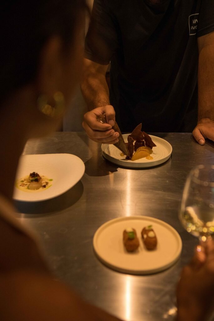
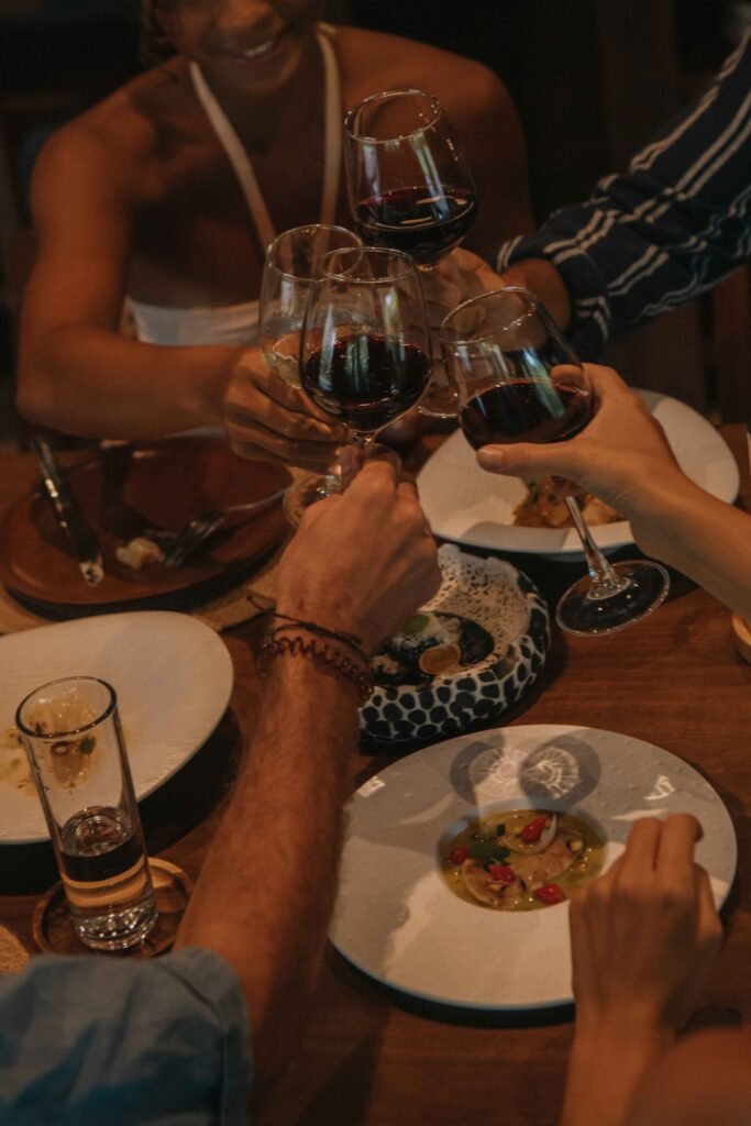
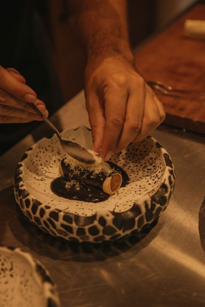
Private Tasting Menu Experience

Treat yourself to an intimate culinary journey — a multi-course tasting menu crafted exclusively for you and served in-villa. From fresh seafood to plant-based delights, this experience is designed to celebrate flavor, texture, and the best of Siargao’s produce. Perfect for romantic dinners, celebrations, or slow luxury nights.

Stay Tuned with Mémé Villa

Sign up for our newsletter to receive our news, deals and special offers.

Close
.main-navigation a { color: #ffffff !important; } .site-header, .site-header-main, .site-header:before, .site-header:after { border-bottom: none !important; box-shadow: none !important; } /* Also remove any divider line from pseudo elements */ .site-header::before, .site-header::after, .site-header-main::before, .site-header-main::after { display: none !important; } /* ===== MC4WP Newsletter Popup Toast ===== */ /* Hide the inline success/error response by default */ .mc4wp-response { display: none !important; } /* Popup overlay backdrop */ #mc4wp-popup-overlay { display: none; position: fixed; top: 0; left: 0; width: 100%; height: 100%; background: rgba(0, 0, 0, 0.5); z-index: 999998; justify-content: center; align-items: center; } #mc4wp-popup-overlay.active { display: flex; } /* Popup box */ #mc4wp-popup-box { background: #3b5248; color: #ffffff; padding: 40px 50px; border-radius: 4px; text-align: center; max-width: 440px; width: 90%; position: relative; box-shadow: 0 20px 60px rgba(0,0,0,0.4); animation: mc4wpPopupIn 0.3s ease; } @keyframes mc4wpPopupIn { from { opacity: 0; transform: scale(0.85); } to { opacity: 1; transform: scale(1); } } /* Icon at top */ #mc4wp-popup-box .mc4wp-popup-icon { font-size: 48px; margin-bottom: 16px; display: block; line-height: 1; } /* Title */ #mc4wp-popup-box .mc4wp-popup-title { font-size: 22px; font-weight: 600; letter-spacing: 0.05em; margin-bottom: 12px; font-family: inherit; text-transform: uppercase; } /* Message text */ #mc4wp-popup-box .mc4wp-popup-message { font-size: 14px; line-height: 1.7; opacity: 0.85; margin-bottom: 24px; } /* Close button */ #mc4wp-popup-box .mc4wp-popup-close { background: rgba(255,255,255,0.15); color: #ffffff; border: 1px solid rgba(255,255,255,0.3); padding: 10px 28px; cursor: pointer; font-size: 13px; letter-spacing: 0.1em; text-transform: uppercase; border-radius: 2px; transition: background 0.2s; } #mc4wp-popup-box .mc4wp-popup-close:hover { background: rgba(255,255,255,0.25); } /* Error popup variant */ #mc4wp-popup-overlay.mc4wp-popup-error #mc4wp-popup-box { background: #6b3535; } /* ===== Contact Page Newsletter Form Fix ===== */ /* Fix subscribe button - remove peach background, make transparent */ .mc4wp-form .newsletter-row input[type="submit"] { background: transparent !important; background-color: transparent !important; color: #ffffff !important; border: none !important; font-size: 13px; letter-spacing: 0.1em; text-transform: uppercase; font-weight: 600; cursor: pointer; padding: 0 0 0 16px !important; white-space: nowrap; } /* Fix email input - remove full border, only show bottom underline via parent */ .mc4wp-form .newsletter-row input[type="email"] { border: none !important; border-bottom: none !important; background: transparent !important; color: #ffffff !important; outline: none !important; box-shadow: none !important; flex: 1; } /* =================================================================== MÉMÉ VILLA SIARGAO — COMPREHENSIVE RESPONSIVE CSS Phase 1 corrected: no horizontal padding on base/desktop rules. Phase 2: padding added ONLY inside media queries, targeting inner content wrappers — never outermost section .e-con. =================================================================== */ /* ---- GLOBAL: Safe overflow handling (don't block vertical scroll) ---- */ .elementor-section-wrap, .entry-content, article { overflow-x: clip; max-width: 100%; } /* Global images stay within their containers */ img { max-width: 100%; height: auto; } /* ---- TABLET (768px – 1024px) ---- */ @media (max-width: 1024px) { /* Scale headings down on tablet */ h1.elementor-heading-title { font-size: clamp(28px, 6vw, 60px) !important; word-break: normal !important; overflow-wrap: break-word; hyphens: auto; } /* Service grid children - allow wrapping on tablet */ .e-con.e-flex > .e-con-inner { flex-wrap: wrap !important; } /* ---- TABLET PADDING: Only on inner content wrappers, NOT outer sections ---- */ /* e-con-boxed inner wrapper gets breathing room */ .elementor-2599 .e-con-boxed > .e-con-inner, .elementor-3411 .e-con-boxed > .e-con-inner, .elementor-3412 .e-con-boxed > .e-con-inner, .elementor-3414 .e-con-boxed > .e-con-inner, .elementor-3467 .e-con-boxed > .e-con-inner, .elementor-2255 .e-con-boxed > .e-con-inner, .elementor-2449 .e-con-boxed > .e-con-inner, .elementor-2445 .e-con-boxed > .e-con-inner, .elementor-2443 .e-con-boxed > .e-con-inner { padding-left: 32px !important; padding-right: 32px !important; } } /* ---- MOBILE (max 767px) ---- */ @media (max-width: 767px) { /* ---- HEADINGS: Scale down ---- */ h1.elementor-heading-title { font-size: clamp(28px, 9vw, 44px) !important; word-break: normal !important; overflow-wrap: break-word !important; hyphens: auto !important; line-height: 1.15 !important; } h2.elementor-heading-title, h3.elementor-heading-title { font-size: clamp(22px, 7vw, 34px) !important; word-break: normal !important; overflow-wrap: break-word !important; hyphens: auto !important; } .cs-title { font-size: clamp(18px, 5.5vw, 26px) !important; word-break: normal !important; overflow-wrap: break-word !important; white-space: normal !important; width: 100% !important; } /* ---- CONTAINERS: Padding ONLY on inner wrappers, never outer section .e-con ---- */ /* boxed inner wrapper */ .elementor-2599 .e-con-boxed > .e-con-inner, .elementor-3411 .e-con-boxed > .e-con-inner, .elementor-3412 .e-con-boxed > .e-con-inner, .elementor-3414 .e-con-boxed > .e-con-inner, .elementor-3467 .e-con-boxed > .e-con-inner, .elementor-2255 .e-con-boxed > .e-con-inner, .elementor-2449 .e-con-boxed > .e-con-inner, .elementor-2445 .e-con-boxed > .e-con-inner, .elementor-2443 .e-con-boxed > .e-con-inner { padding-left: 20px !important; padding-right: 20px !important; } /* Keep appropriate top/bottom padding on hero sections */ .elementor-2599 .e-con:first-child { padding-top: 120px !important; } /* ---- FLEX: Stack columns on mobile ---- */ .e-con.e-flex > .e-con-inner { flex-direction: column !important; flex-wrap: wrap !important; } /* EXCEPTION: Keep newsletter row as horizontal */ .mc4wp-form .newsletter-row { flex-direction: row !important; flex-wrap: nowrap !important; } /* ---- BOXED CONTAINERS: Constrain max-width ---- */ .e-con-boxed > .e-con-inner { max-width: 100% !important; width: 100% !important; } /* ---- CS TITLE HEADINGS: Full width ---- */ .cs-title, .cs-info-box-title, .cs-info-box-text { width: 100% !important; max-width: 100% !important; } /* ---- IMAGES ---- */ img { max-width: 100%; height: auto; } /* ---- SLIDERS ---- */ .slick-slider { width: 100% !important; overflow: hidden !important; } } /* ---- SMALL MOBILE (max 480px) ---- */ @media (max-width: 480px) { h1.elementor-heading-title { font-size: clamp(24px, 8vw, 36px) !important; } .cs-title { font-size: clamp(16px, 5vw, 22px) !important; } /* Newsletter form stacks on very small screens */ .mc4wp-form .newsletter-row { flex-direction: column !important; align-items: flex-start !important; gap: 12px; } .mc4wp-form .newsletter-row input[type="email"] { width: 100% !important; } } /* =================================================================== MOBILE & TABLET NAVIGATION ROOT FIX (Elementor Advanced > Responsive): Header container d59b522 — "Hide on Tablet" and "Hide on Mobile" removed. Template 3247. ELEMENTOR SETTING: d59b522 flex_direction_mobile = 'column' (stacks at ≤767px). Child containers 1cf7074 & 2e5bd5b width_mobile = 100%. CSS below: dark bg on mobile so stacked nav is readable; compact text on tablet so links don't overflow horizontally. =================================================================== */ /* ---- TABLET (≤1024px): Compact text so nav fits on fewer rows ---- */ @media (max-width: 1024px) { /* Slightly smaller nav link font on tablet */ .elementor-3247 .cs-menu.main-navigation .primary-menu > li > a { font-size: 11px !important; letter-spacing: 0.04em !important; } } /* ---- MOBILE (≤767px): Dark header background for stacked nav ---- */ @media (max-width: 767px) { /* Dark background so white nav text is readable on mobile */ .elementor-3247 [data-id="d59b522"] { background: rgba(15, 22, 20, 0.92) !important; } /* Separator lines between mobile nav items */ .elementor-3247 .cs-menu.main-navigation .primary-menu > li { border-bottom: 1px solid rgba(255,255,255,0.12) !important; } /* Comfortable touch targets for mobile links */ .elementor-3247 .cs-menu.main-navigation .primary-menu > li > a { padding: 12px 0 !important; font-size: 12px !important; letter-spacing: 0.1em !important; display: block !important; } } /* ----- MOBILE NAV STACKING: Force menu items to column on mobile ----- */ @media (max-width: 767px) { /* Stack nav items vertically */ .elementor-3247 .cs-menu.main-navigation .primary-menu { flex-direction: column !important; align-items: flex-start !important; width: 100% !important; } /* Full width list items */ .elementor-3247 .cs-menu.main-navigation .primary-menu > li { width: 100% !important; } /* Center logo on mobile */ .elementor-3247 .elementor-element-861a5ad { width: 100% !important; text-align: center !important; } }
Close