Book direct. Stay longer. Feel more.
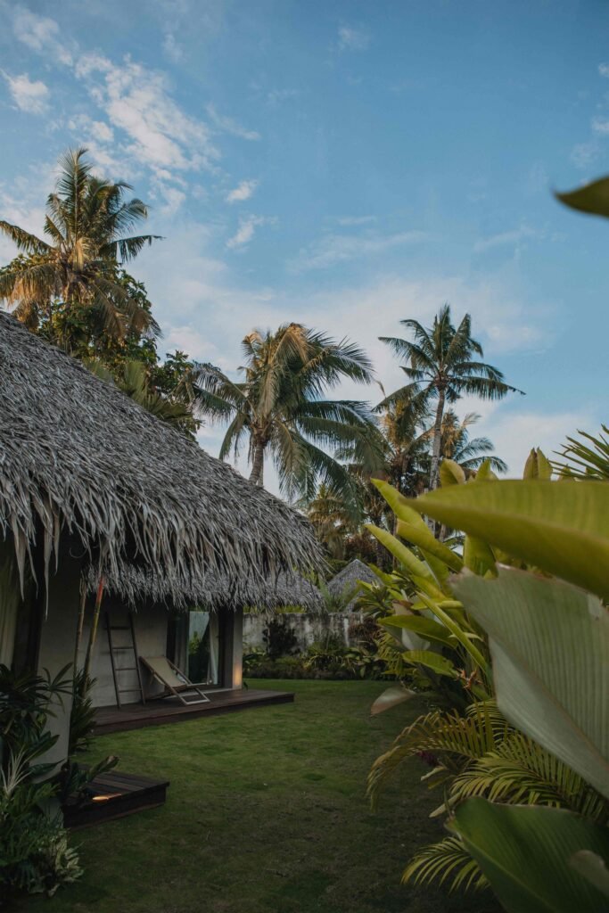
At Mémé Villa, you'll feel that special warmth, a true sense of home, peace, and comfort.
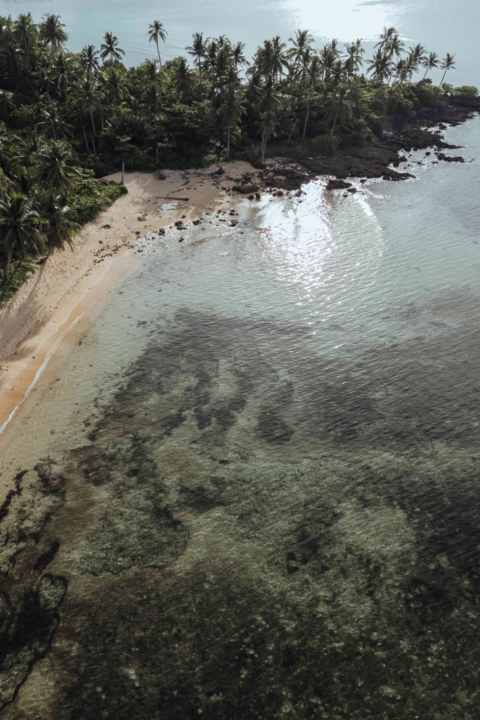
Whether you've been paddleboarding through the mangroves, surfing perfect waves, soaking up the sun at the beach, or discovering the north of the island, this is the place to come back to. Siargao is full of magic, and Mémé Villa is your sanctuary in the middle of it all.
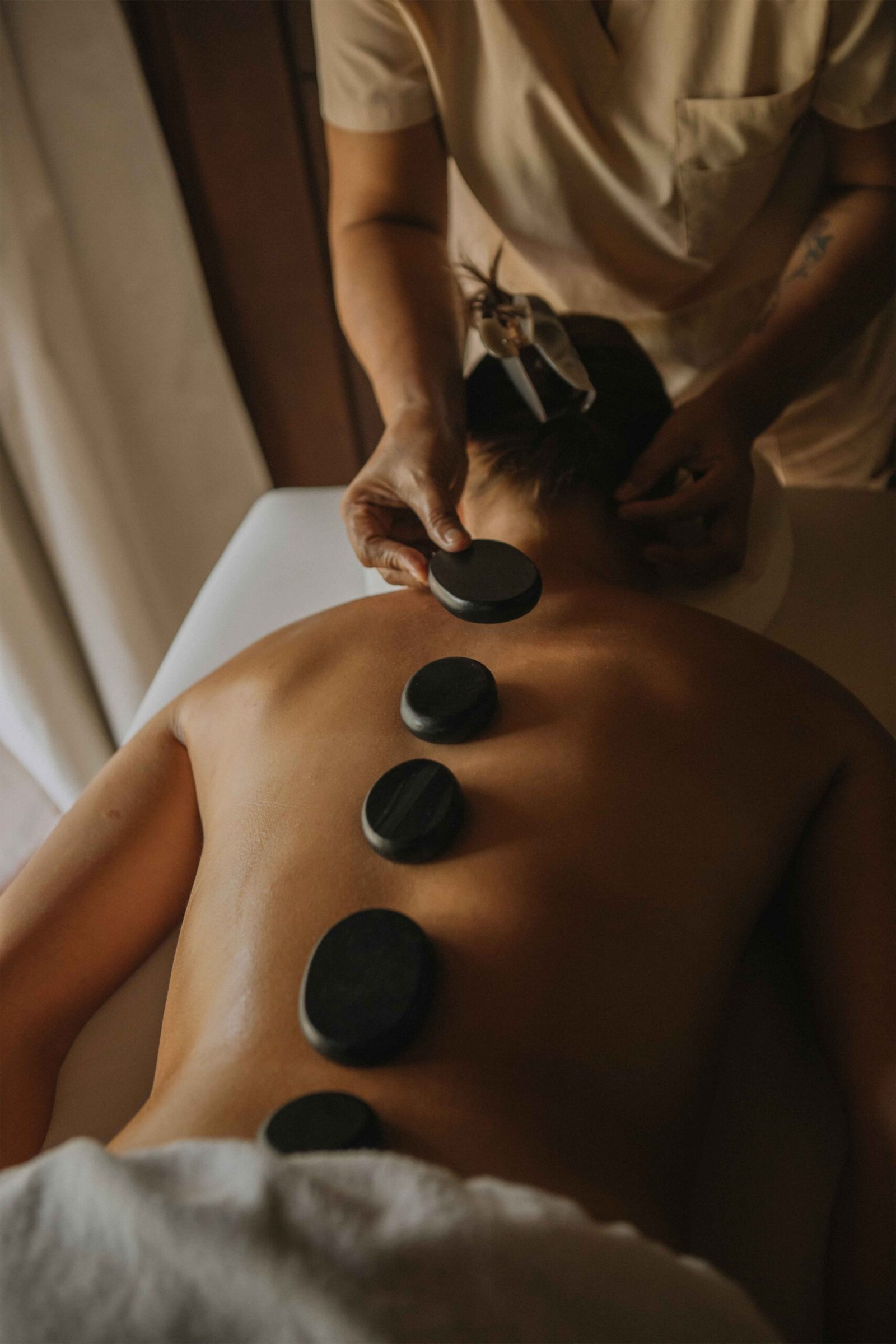
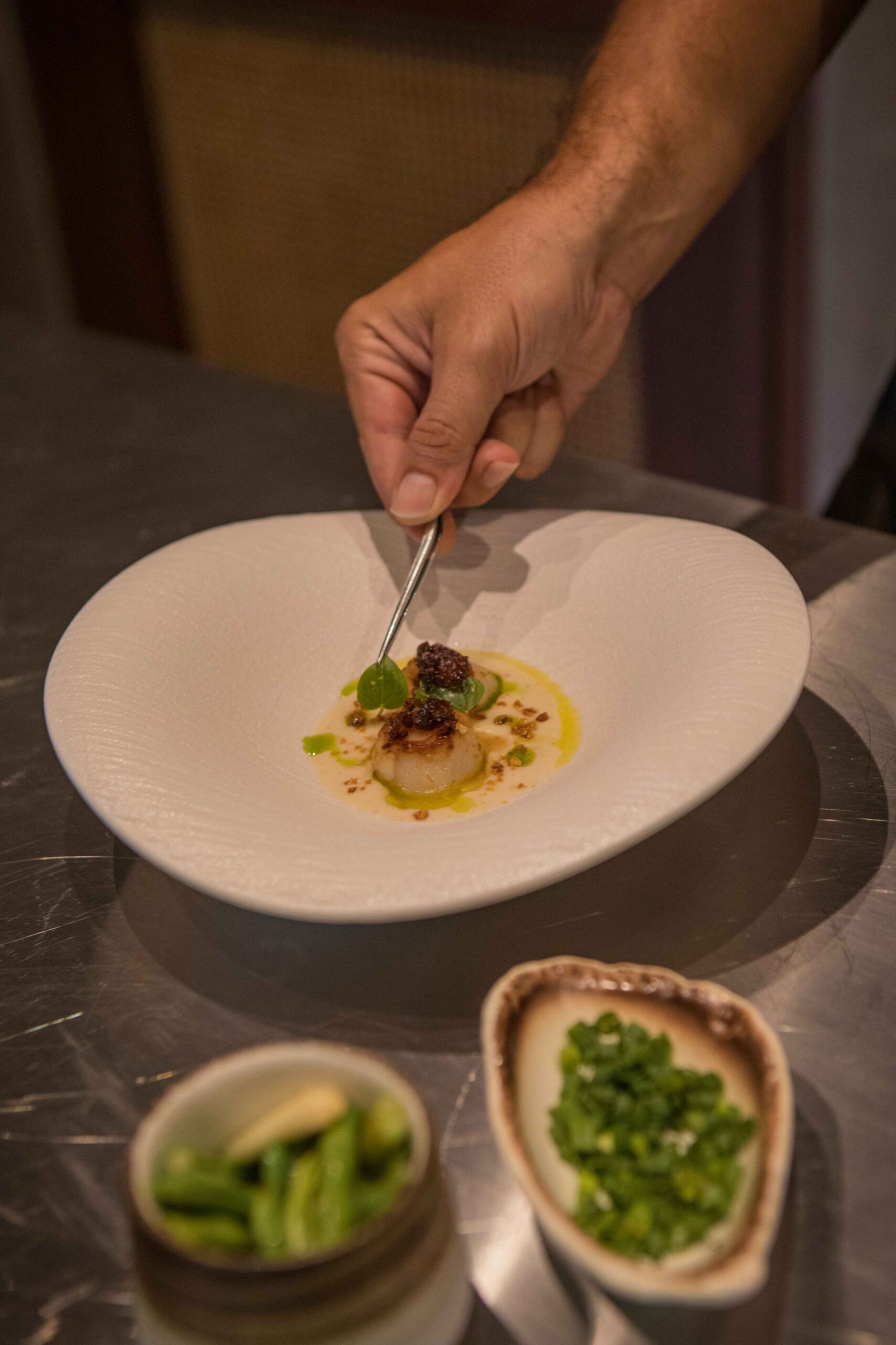
At Mémé Villa, we believe that a stay is more than just a place to sleep, it's a feeling, an experience. That's why we’ve created Mémé Villa Experiences, designed to make your time with us truly unforgettable.
Whether it’s a relaxing spa treatment in the comfort of your villa or a personalized island adventure crafted just for you, every detail is thoughtfully curated to enhance your stay and connect you with the beauty and spirit of Siargao.
Two stylish private bedrooms, each with its own en-suite bathroom
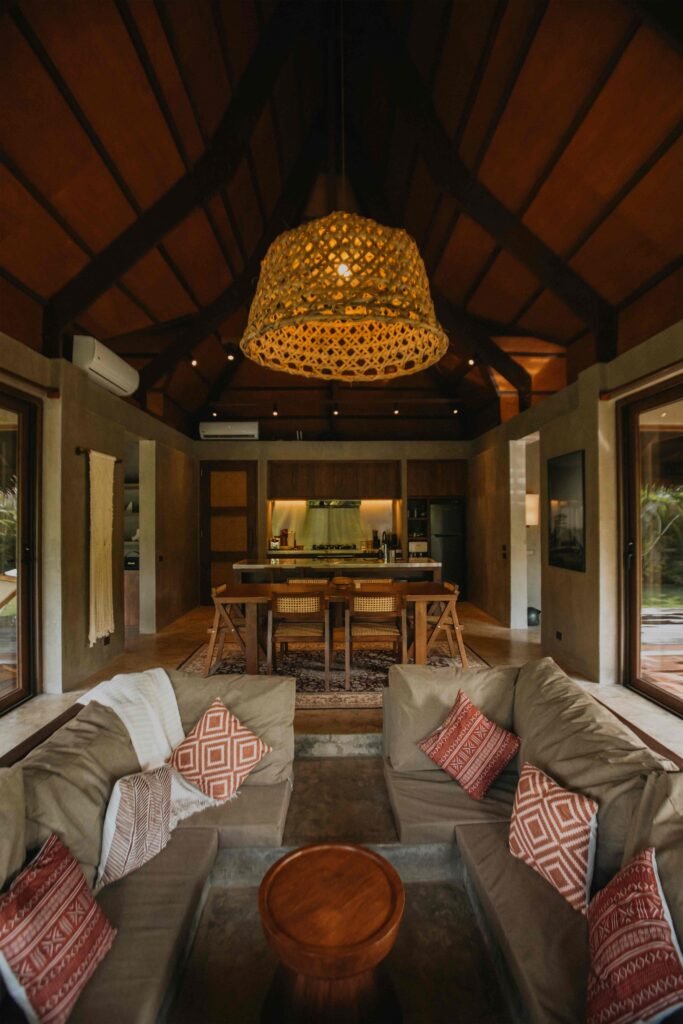
A bright living & dining space with a cozy sunken sofa
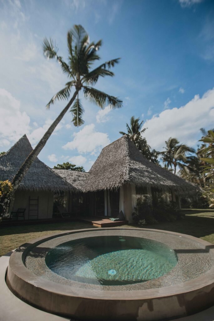
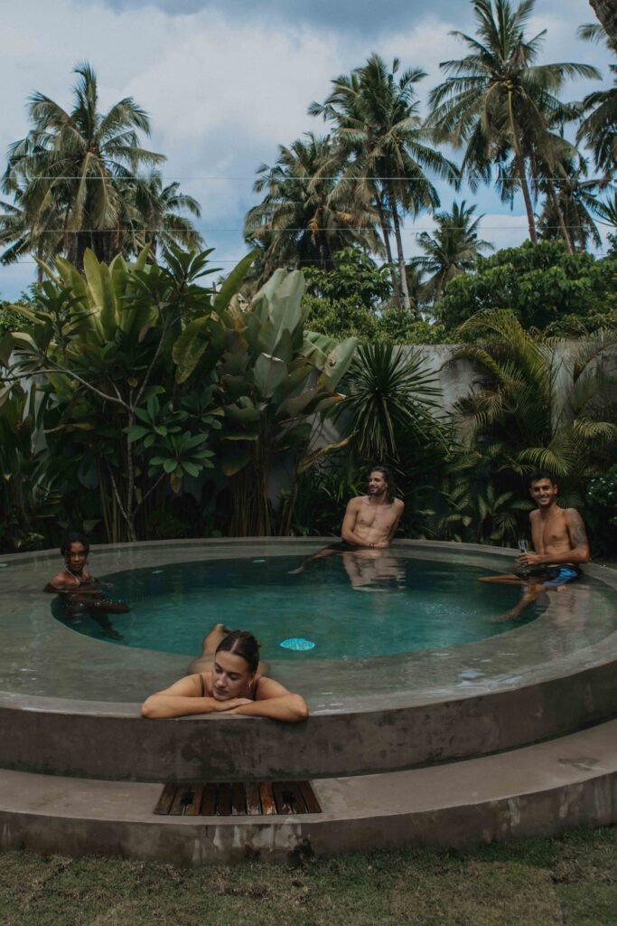
Pool
A high-end, fully equipped kitchen
Massage treatments (in-villa, by trusted therapists)
Private parking
Great Wi-Fi connection
Private airport transfer
CCTV
24h Frontdesk and Security
Housekeeper Day service
Bathroom Amenities (Towel, Bathrobes, Shampoo, Showergel, Hair Dryer)
Two stylish private bedrooms, each with its own en-suite bathroom
A bright living & dining space with a cozy sunken sofa
Pool
A high-end, fully equipped kitchen
Massage treatments (in-villa, by trusted therapists)
Private parking
Great Wi-Fi connection
Private airport transfer
CCTV
24h Frontdesk and Security
Housekeeper Day service
Bathroom Amenities (Towel, Bathrobes, Shampoo, Showergel, Hair Dryer)