Discovering Siargao: More Than Just Waves

August 9, 2025
Scroll Down

A journey into the island’s roots, rhythms, and raw beauty

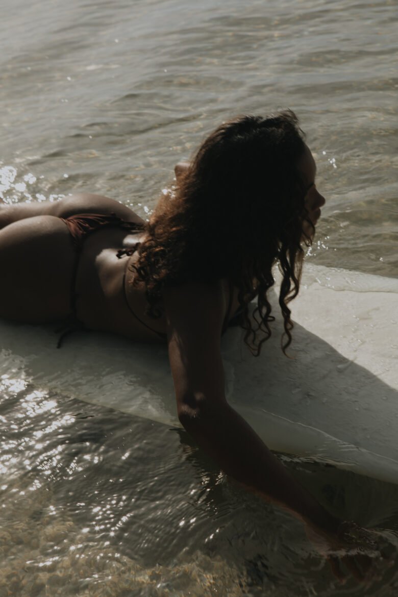
Siargao may be world-famous for its waves — but this teardrop-shaped island in the Philippine Sea is so much more than a surfer’s paradise. It's a place where nature, culture, and community intertwine in a way that touches everyone who visits.

A Brief History of the Island

For centuries, Siargao was a quiet island, mostly known only to local fishermen and farmers. Its name is said to come from the word “Siargaw” or “Saliargaw,” a native mangrove species that thrives along the island’s coastline — still visible today in the rich, tangled roots that protect its shores.

While the island remained off the radar for much of the 20th century, its warm-hearted people, abundant natural resources, and laid-back lifestyle slowly attracted curious travelers. Everything changed in the 1990s when Cloud 9, one of the world’s most perfect right-hand surf breaks, was discovered by foreign surfers — and Siargao’s global story began.

More Than Surf Culture

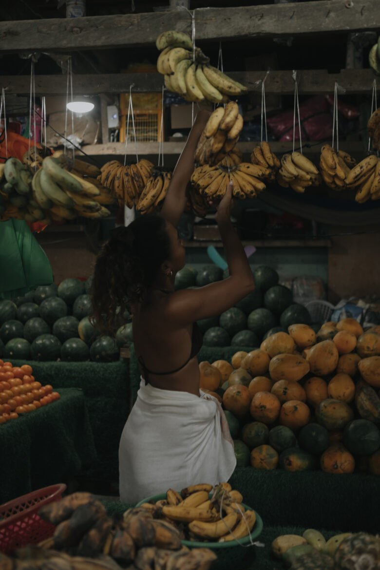
Yes, surfing is deeply woven into the island’s DNA — but Siargao’s identity goes beyond the board. Locals have preserved a lifestyle of simplicity and sustainability. Life flows with the tides. Fishermen still head out at dawn. Children play barefoot in the rain. And coconut palms stretch as far as the eye can see.

There’s a deep respect here for nature, and many visitors find themselves slowing down, tuning in, and letting go of the fast pace they came from. That’s what makes Siargao special — it's not just about what you do, but how you feel while you’re here.

Local Culture & Traditions

The Siargaonon people are known for their warmth, hospitality, and strong sense of community. Traditional Filipino values like “bayanihan” (the spirit of communal unity) are alive and well here — you’ll feel it when a local offers you directions, or when neighbors help each other rebuild after a storm.

Music and celebration are part of everyday life. From casual karaoke nights to colorful fiestas, the island pulses with joy and resilience. Don’t be surprised if you're invited to a local gathering — sharing food, stories, and smiles is a natural part of life here.

A Place to Reconnect

Siargao invites you to be present. To wake up with the sun, swim in jungle rivers, paddle through mangroves, or share a coconut with strangers who become friends. It’s a destination that nurtures mind, body, and spirit — whether you come to surf, rest, explore, or simply breathe.

Stay Where the Heart of the Island Lives

At Mémé Villa, we created a space that honors this island spirit — private, soulful, and in tune with Siargao’s essence. When you stay with us, you’re not just visiting. You’re becoming part of the story.

Close
.main-navigation a { color: #ffffff !important; } .site-header, .site-header-main, .site-header:before, .site-header:after { border-bottom: none !important; box-shadow: none !important; } /* Also remove any divider line from pseudo elements */ .site-header::before, .site-header::after, .site-header-main::before, .site-header-main::after { display: none !important; } /* ===== MC4WP Newsletter Popup Toast ===== */ /* Hide the inline success/error response by default */ .mc4wp-response { display: none !important; } /* Popup overlay backdrop */ #mc4wp-popup-overlay { display: none; position: fixed; top: 0; left: 0; width: 100%; height: 100%; background: rgba(0, 0, 0, 0.5); z-index: 999998; justify-content: center; align-items: center; } #mc4wp-popup-overlay.active { display: flex; } /* Popup box */ #mc4wp-popup-box { background: #3b5248; color: #ffffff; padding: 40px 50px; border-radius: 4px; text-align: center; max-width: 440px; width: 90%; position: relative; box-shadow: 0 20px 60px rgba(0,0,0,0.4); animation: mc4wpPopupIn 0.3s ease; } @keyframes mc4wpPopupIn { from { opacity: 0; transform: scale(0.85); } to { opacity: 1; transform: scale(1); } } /* Icon at top */ #mc4wp-popup-box .mc4wp-popup-icon { font-size: 48px; margin-bottom: 16px; display: block; line-height: 1; } /* Title */ #mc4wp-popup-box .mc4wp-popup-title { font-size: 22px; font-weight: 600; letter-spacing: 0.05em; margin-bottom: 12px; font-family: inherit; text-transform: uppercase; } /* Message text */ #mc4wp-popup-box .mc4wp-popup-message { font-size: 14px; line-height: 1.7; opacity: 0.85; margin-bottom: 24px; } /* Close button */ #mc4wp-popup-box .mc4wp-popup-close { background: rgba(255,255,255,0.15); color: #ffffff; border: 1px solid rgba(255,255,255,0.3); padding: 10px 28px; cursor: pointer; font-size: 13px; letter-spacing: 0.1em; text-transform: uppercase; border-radius: 2px; transition: background 0.2s; } #mc4wp-popup-box .mc4wp-popup-close:hover { background: rgba(255,255,255,0.25); } /* Error popup variant */ #mc4wp-popup-overlay.mc4wp-popup-error #mc4wp-popup-box { background: #6b3535; } /* ===== Contact Page Newsletter Form Fix ===== */ /* Fix subscribe button - remove peach background, make transparent */ .mc4wp-form .newsletter-row input[type="submit"] { background: transparent !important; background-color: transparent !important; color: #ffffff !important; border: none !important; font-size: 13px; letter-spacing: 0.1em; text-transform: uppercase; font-weight: 600; cursor: pointer; padding: 0 0 0 16px !important; white-space: nowrap; } /* Fix email input - remove full border, only show bottom underline via parent */ .mc4wp-form .newsletter-row input[type="email"] { border: none !important; border-bottom: none !important; background: transparent !important; color: #ffffff !important; outline: none !important; box-shadow: none !important; flex: 1; } /* =================================================================== MÉMÉ VILLA SIARGAO — COMPREHENSIVE RESPONSIVE CSS Phase 1 corrected: no horizontal padding on base/desktop rules. Phase 2: padding added ONLY inside media queries, targeting inner content wrappers — never outermost section .e-con. =================================================================== */ /* ---- GLOBAL: Safe overflow handling (don't block vertical scroll) ---- */ .elementor-section-wrap, .entry-content, article { overflow-x: clip; max-width: 100%; } /* Global images stay within their containers */ img { max-width: 100%; height: auto; } /* ---- TABLET (768px – 1024px) ---- */ @media (max-width: 1024px) { /* Scale headings down on tablet */ h1.elementor-heading-title { font-size: clamp(28px, 6vw, 60px) !important; word-break: normal !important; overflow-wrap: break-word; hyphens: auto; } /* Service grid children - allow wrapping on tablet */ .e-con.e-flex > .e-con-inner { flex-wrap: wrap !important; } /* ---- TABLET PADDING: Only on inner content wrappers, NOT outer sections ---- */ /* e-con-boxed inner wrapper gets breathing room */ .elementor-2599 .e-con-boxed > .e-con-inner, .elementor-3411 .e-con-boxed > .e-con-inner, .elementor-3412 .e-con-boxed > .e-con-inner, .elementor-3414 .e-con-boxed > .e-con-inner, .elementor-3467 .e-con-boxed > .e-con-inner, .elementor-2255 .e-con-boxed > .e-con-inner, .elementor-2449 .e-con-boxed > .e-con-inner, .elementor-2445 .e-con-boxed > .e-con-inner, .elementor-2443 .e-con-boxed > .e-con-inner { padding-left: 32px !important; padding-right: 32px !important; } } /* ---- MOBILE (max 767px) ---- */ @media (max-width: 767px) { /* ---- HEADINGS: Scale down ---- */ h1.elementor-heading-title { font-size: clamp(28px, 9vw, 44px) !important; word-break: normal !important; overflow-wrap: break-word !important; hyphens: auto !important; line-height: 1.15 !important; } h2.elementor-heading-title, h3.elementor-heading-title { font-size: clamp(22px, 7vw, 34px) !important; word-break: normal !important; overflow-wrap: break-word !important; hyphens: auto !important; } .cs-title { font-size: clamp(18px, 5.5vw, 26px) !important; word-break: normal !important; overflow-wrap: break-word !important; white-space: normal !important; width: 100% !important; } /* ---- CONTAINERS: Padding ONLY on inner wrappers, never outer section .e-con ---- */ /* boxed inner wrapper */ .elementor-2599 .e-con-boxed > .e-con-inner, .elementor-3411 .e-con-boxed > .e-con-inner, .elementor-3412 .e-con-boxed > .e-con-inner, .elementor-3414 .e-con-boxed > .e-con-inner, .elementor-3467 .e-con-boxed > .e-con-inner, .elementor-2255 .e-con-boxed > .e-con-inner, .elementor-2449 .e-con-boxed > .e-con-inner, .elementor-2445 .e-con-boxed > .e-con-inner, .elementor-2443 .e-con-boxed > .e-con-inner { padding-left: 20px !important; padding-right: 20px !important; } /* Keep appropriate top/bottom padding on hero sections */ .elementor-2599 .e-con:first-child { padding-top: 120px !important; } /* ---- FLEX: Stack columns on mobile ---- */ .e-con.e-flex > .e-con-inner { flex-direction: column !important; flex-wrap: wrap !important; } /* EXCEPTION: Keep newsletter row as horizontal */ .mc4wp-form .newsletter-row { flex-direction: row !important; flex-wrap: nowrap !important; } /* ---- BOXED CONTAINERS: Constrain max-width ---- */ .e-con-boxed > .e-con-inner { max-width: 100% !important; width: 100% !important; } /* ---- CS TITLE HEADINGS: Full width ---- */ .cs-title, .cs-info-box-title, .cs-info-box-text { width: 100% !important; max-width: 100% !important; } /* ---- IMAGES ---- */ img { max-width: 100%; height: auto; } /* ---- SLIDERS ---- */ .slick-slider { width: 100% !important; overflow: hidden !important; } } /* ---- SMALL MOBILE (max 480px) ---- */ @media (max-width: 480px) { h1.elementor-heading-title { font-size: clamp(24px, 8vw, 36px) !important; } .cs-title { font-size: clamp(16px, 5vw, 22px) !important; } /* Newsletter form stacks on very small screens */ .mc4wp-form .newsletter-row { flex-direction: column !important; align-items: flex-start !important; gap: 12px; } .mc4wp-form .newsletter-row input[type="email"] { width: 100% !important; } } /* =================================================================== MOBILE & TABLET NAVIGATION ROOT FIX (Elementor Advanced > Responsive): Header container d59b522 — "Hide on Tablet" and "Hide on Mobile" removed. Template 3247. ELEMENTOR SETTING: d59b522 flex_direction_mobile = 'column' (stacks at ≤767px). Child containers 1cf7074 & 2e5bd5b width_mobile = 100%. CSS below: dark bg on mobile so stacked nav is readable; compact text on tablet so links don't overflow horizontally. =================================================================== */ /* ---- TABLET (≤1024px): Compact text so nav fits on fewer rows ---- */ @media (max-width: 1024px) { /* Slightly smaller nav link font on tablet */ .elementor-3247 .cs-menu.main-navigation .primary-menu > li > a { font-size: 11px !important; letter-spacing: 0.04em !important; } } /* ---- MOBILE (≤767px): Dark header background for stacked nav ---- */ @media (max-width: 767px) { /* Dark background so white nav text is readable on mobile */ .elementor-3247 [data-id="d59b522"] { background: rgba(15, 22, 20, 0.92) !important; } /* Separator lines between mobile nav items */ .elementor-3247 .cs-menu.main-navigation .primary-menu > li { border-bottom: 1px solid rgba(255,255,255,0.12) !important; } /* Comfortable touch targets for mobile links */ .elementor-3247 .cs-menu.main-navigation .primary-menu > li > a { padding: 12px 0 !important; font-size: 12px !important; letter-spacing: 0.1em !important; display: block !important; } } /* ----- MOBILE NAV STACKING: Force menu items to column on mobile ----- */ @media (max-width: 767px) { /* Stack nav items vertically */ .elementor-3247 .cs-menu.main-navigation .primary-menu { flex-direction: column !important; align-items: flex-start !important; width: 100% !important; } /* Full width list items */ .elementor-3247 .cs-menu.main-navigation .primary-menu > li { width: 100% !important; } /* Center logo on mobile */ .elementor-3247 .elementor-element-861a5ad { width: 100% !important; text-align: center !important; } }
Close