spa treatments

Relax. Reconnect. Renew — Island-style.​

At Meme Villa, we offer more than just massages, we offer moments of true connection and rejuvenation, crafted with care and intention.

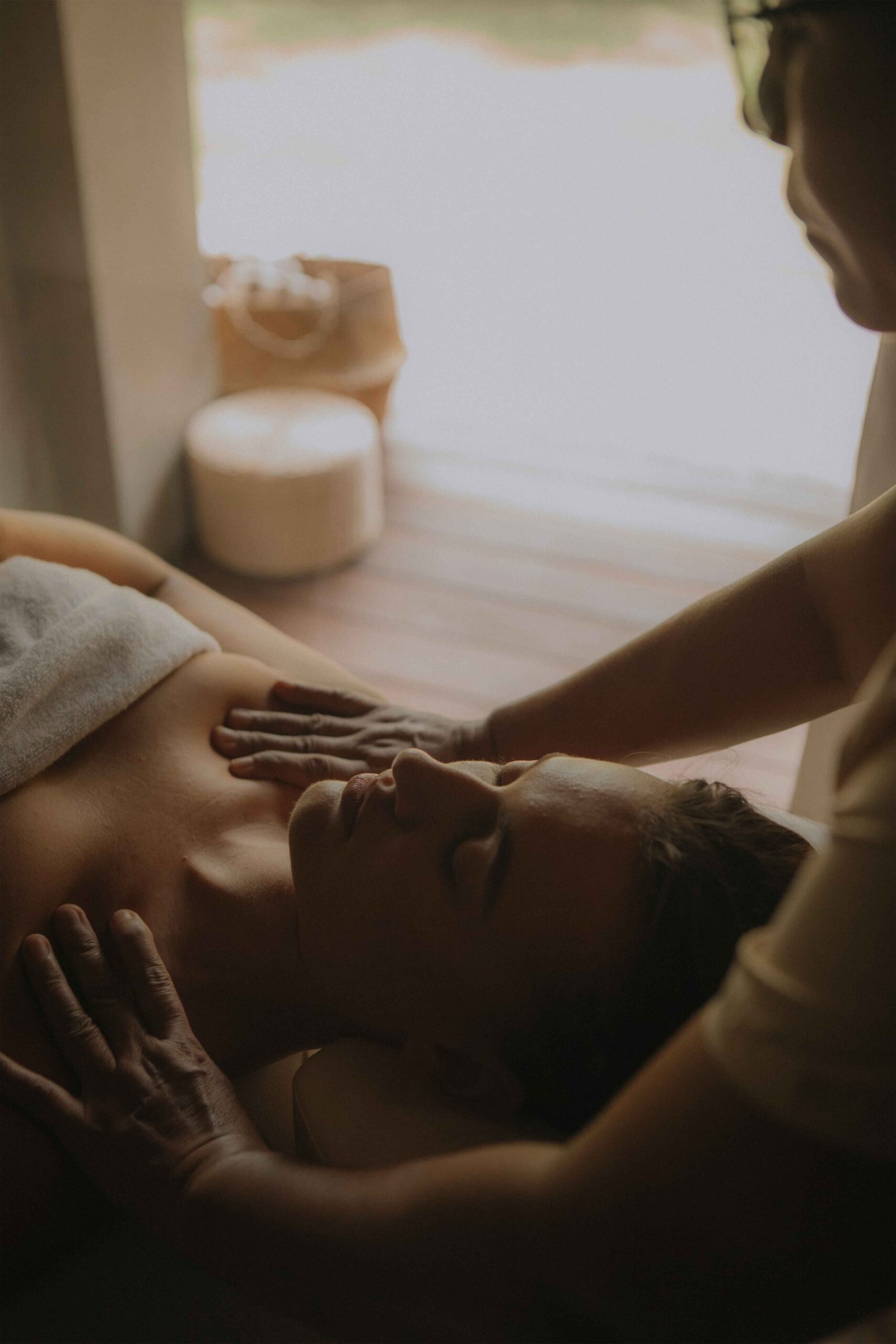
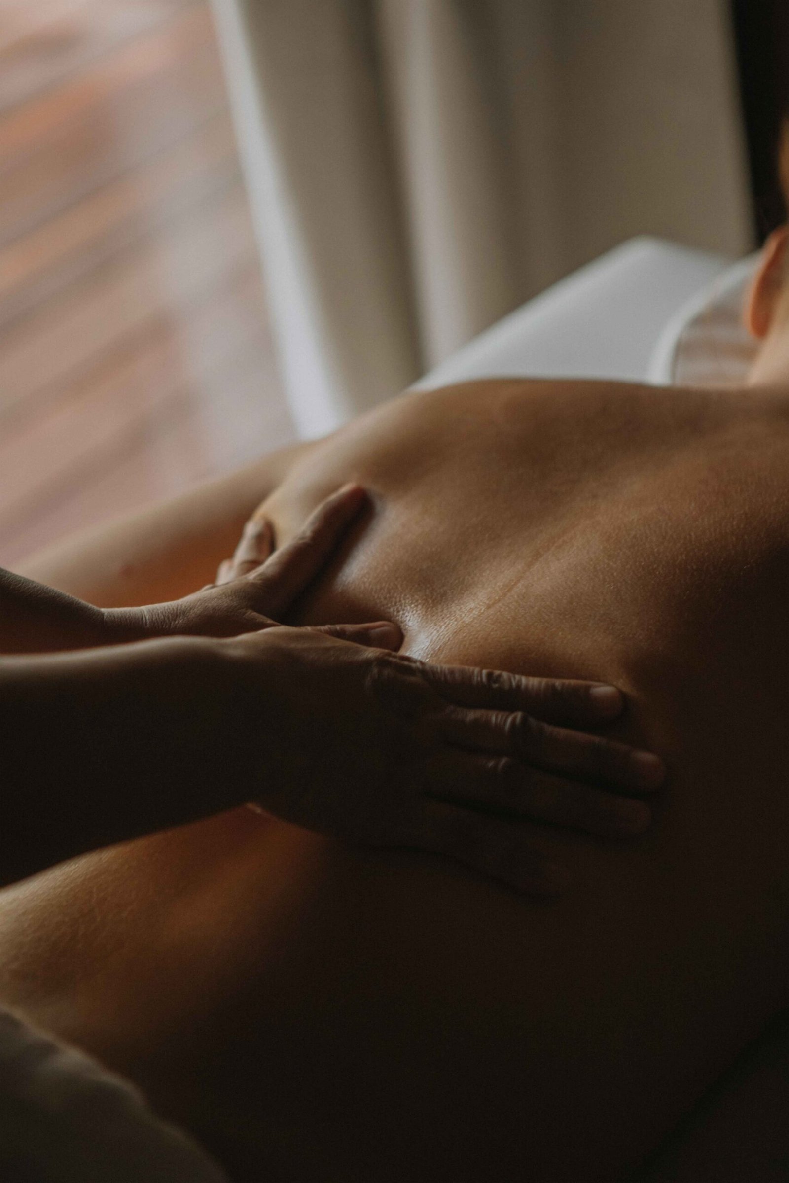
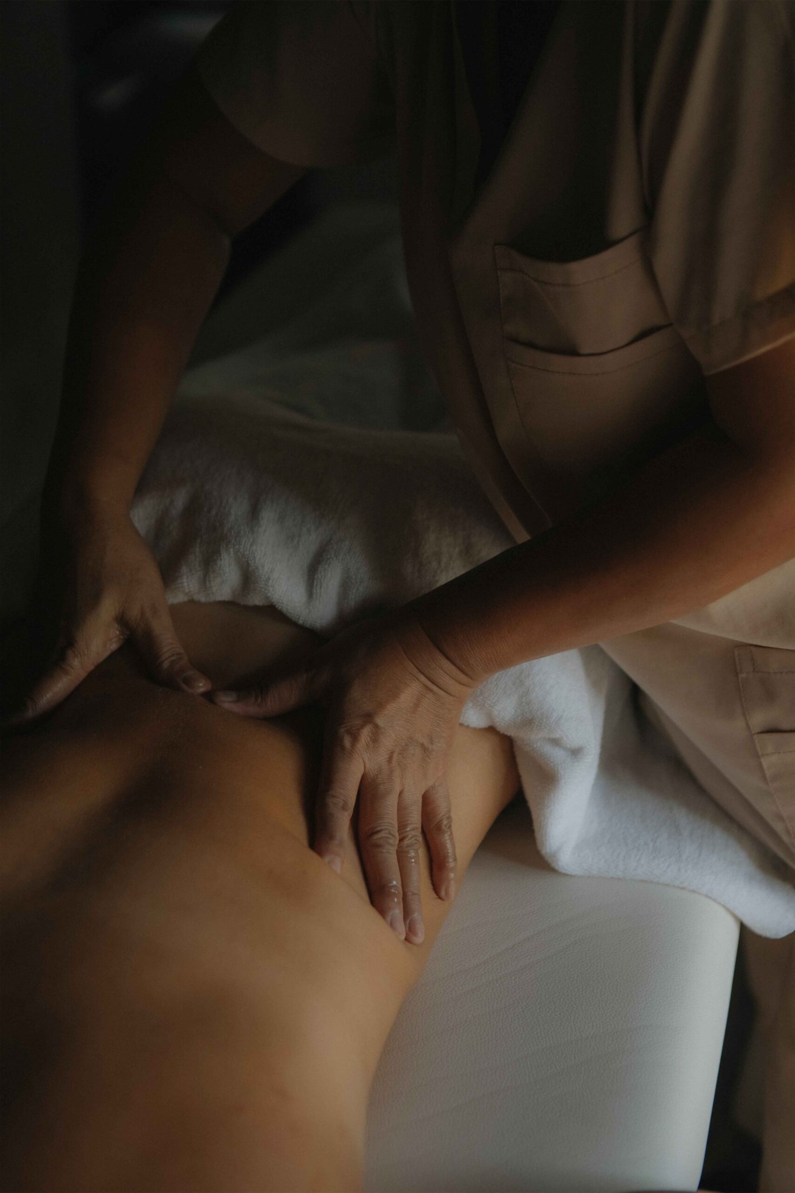
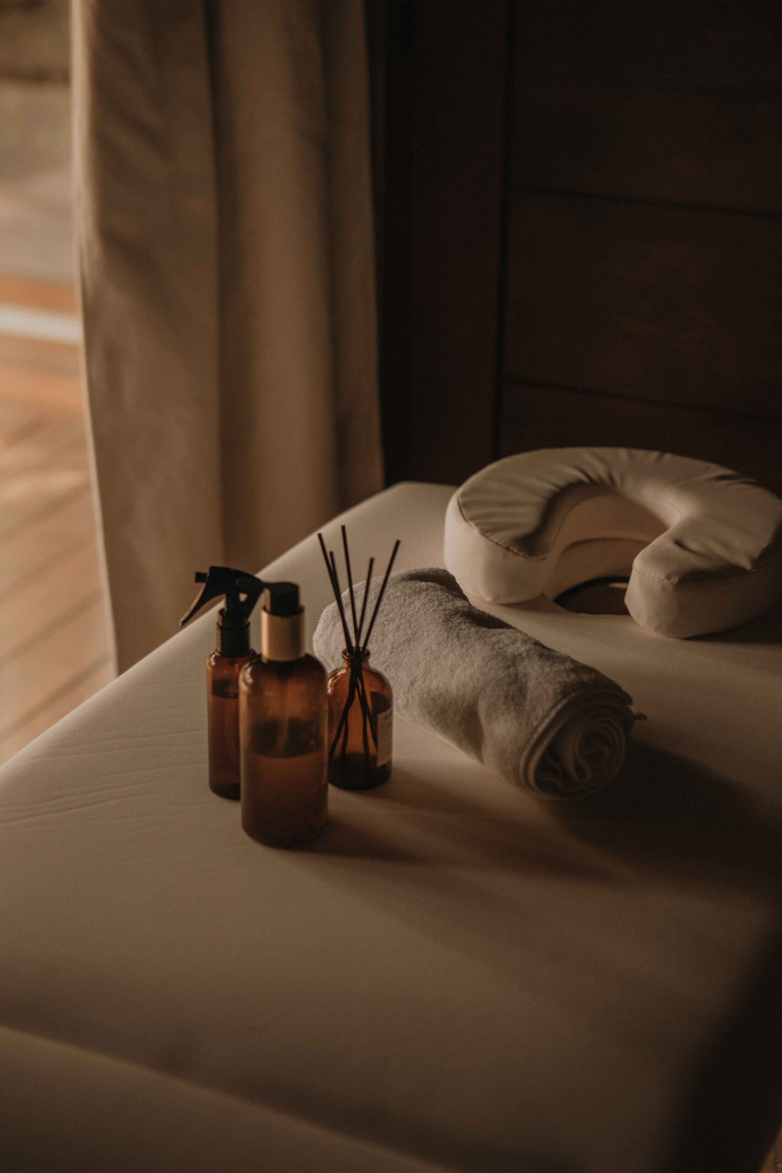
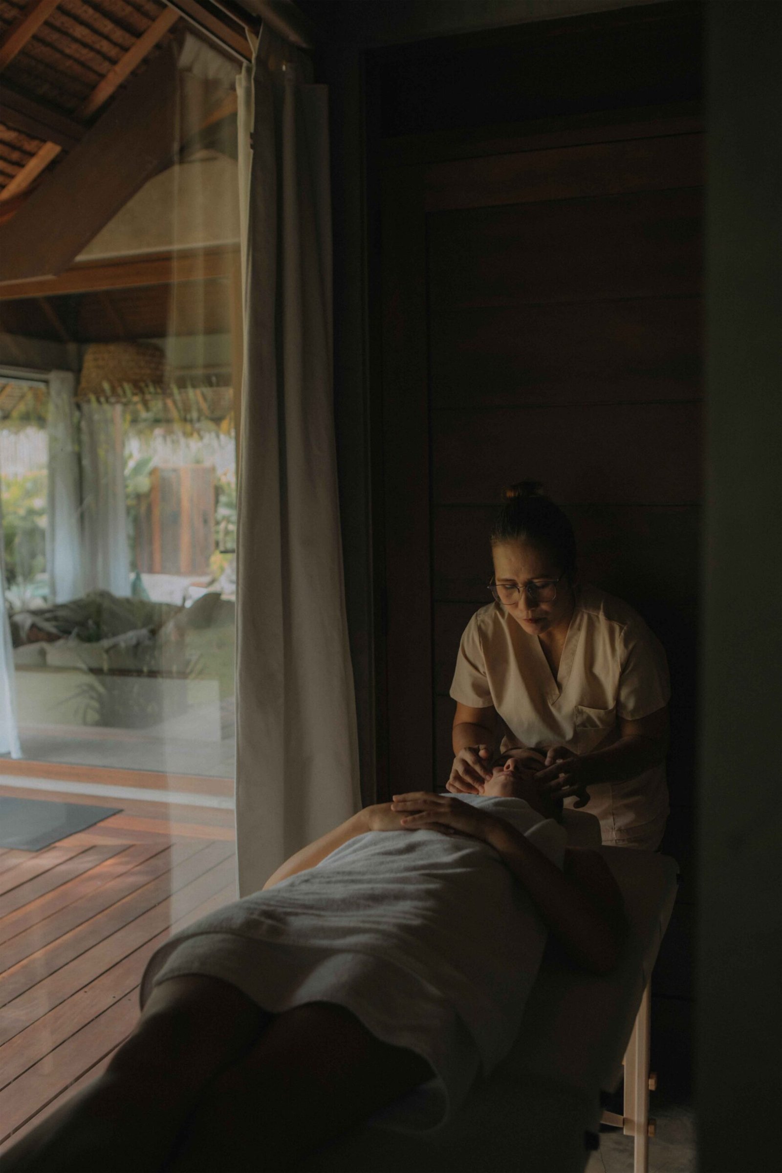
Each treatment is performed on a professional massage bed, never on the regular sleeping bed, ensuring maximum comfort and proper technique.

Before your session begins, we serve a warm cup of ginger tea to calm your body and prepare your senses. After your treatment, enjoy another cup to complete the experience, leaving you fully relaxed and refreshed.

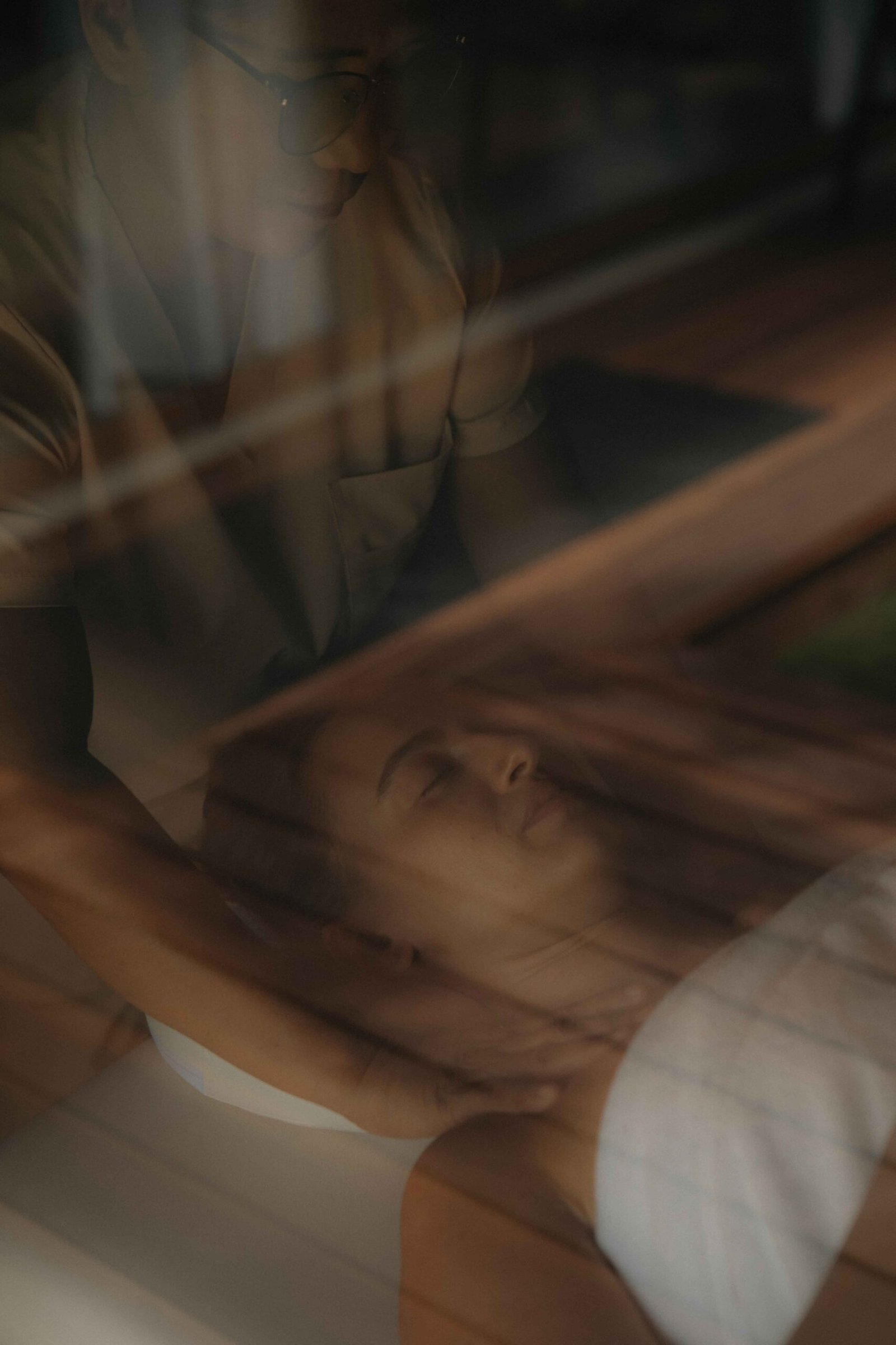
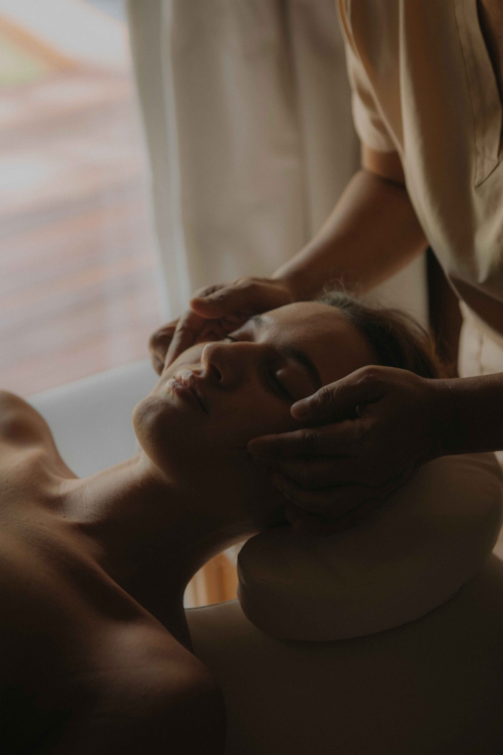
We create the perfect ambiance in your room with soothing music, subtle lighting, and thoughtful details that make each session feel personal, private, and deeply restorative.

Our Services

Combination Massage

1h 15min
1,800
A well-balanced blend of Swedish and deep tissue massage, designed to improve circulation and relieve muscle tension.

Combination Massage

2h
2,800
Enjoy the full experience with extended time for deep relaxation — perfect for releasing built-up stress.

Aloe Vera Massage

1h
1,900
Ideal after a sunny day. Natural aloe vera is gently massaged into the skin for cooling hydration and skin renewal.

Hot Stone Massage

1h 30min
2,500
Warm basalt stones combined with deep massage techniques help melt away stress and relax the body at a deep level.

Ventosa Massage

1h 30min
2,500
Inspired by traditional cupping therapy, this treatment boosts blood flow and releases energetic blockages for full-body balance.

Stay Tuned with Mémé Villa

Sign up for our newsletter to receive our news, deals and special offers.

Close
.main-navigation a { color: #ffffff !important; } .site-header, .site-header-main, .site-header:before, .site-header:after { border-bottom: none !important; box-shadow: none !important; } /* Also remove any divider line from pseudo elements */ .site-header::before, .site-header::after, .site-header-main::before, .site-header-main::after { display: none !important; } /* ===== MC4WP Newsletter Popup Toast ===== */ /* Hide the inline success/error response by default */ .mc4wp-response { display: none !important; } /* Popup overlay backdrop */ #mc4wp-popup-overlay { display: none; position: fixed; top: 0; left: 0; width: 100%; height: 100%; background: rgba(0, 0, 0, 0.5); z-index: 999998; justify-content: center; align-items: center; } #mc4wp-popup-overlay.active { display: flex; } /* Popup box */ #mc4wp-popup-box { background: #3b5248; color: #ffffff; padding: 40px 50px; border-radius: 4px; text-align: center; max-width: 440px; width: 90%; position: relative; box-shadow: 0 20px 60px rgba(0,0,0,0.4); animation: mc4wpPopupIn 0.3s ease; } @keyframes mc4wpPopupIn { from { opacity: 0; transform: scale(0.85); } to { opacity: 1; transform: scale(1); } } /* Icon at top */ #mc4wp-popup-box .mc4wp-popup-icon { font-size: 48px; margin-bottom: 16px; display: block; line-height: 1; } /* Title */ #mc4wp-popup-box .mc4wp-popup-title { font-size: 22px; font-weight: 600; letter-spacing: 0.05em; margin-bottom: 12px; font-family: inherit; text-transform: uppercase; } /* Message text */ #mc4wp-popup-box .mc4wp-popup-message { font-size: 14px; line-height: 1.7; opacity: 0.85; margin-bottom: 24px; } /* Close button */ #mc4wp-popup-box .mc4wp-popup-close { background: rgba(255,255,255,0.15); color: #ffffff; border: 1px solid rgba(255,255,255,0.3); padding: 10px 28px; cursor: pointer; font-size: 13px; letter-spacing: 0.1em; text-transform: uppercase; border-radius: 2px; transition: background 0.2s; } #mc4wp-popup-box .mc4wp-popup-close:hover { background: rgba(255,255,255,0.25); } /* Error popup variant */ #mc4wp-popup-overlay.mc4wp-popup-error #mc4wp-popup-box { background: #6b3535; } /* ===== Contact Page Newsletter Form Fix ===== */ /* Fix subscribe button - remove peach background, make transparent */ .mc4wp-form .newsletter-row input[type="submit"] { background: transparent !important; background-color: transparent !important; color: #ffffff !important; border: none !important; font-size: 13px; letter-spacing: 0.1em; text-transform: uppercase; font-weight: 600; cursor: pointer; padding: 0 0 0 16px !important; white-space: nowrap; } /* Fix email input - remove full border, only show bottom underline via parent */ .mc4wp-form .newsletter-row input[type="email"] { border: none !important; border-bottom: none !important; background: transparent !important; color: #ffffff !important; outline: none !important; box-shadow: none !important; flex: 1; } /* =================================================================== MÉMÉ VILLA SIARGAO — COMPREHENSIVE RESPONSIVE CSS Phase 1 corrected: no horizontal padding on base/desktop rules. Phase 2: padding added ONLY inside media queries, targeting inner content wrappers — never outermost section .e-con. =================================================================== */ /* ---- GLOBAL: Safe overflow handling (don't block vertical scroll) ---- */ .elementor-section-wrap, .entry-content, article { overflow-x: clip; max-width: 100%; } /* Global images stay within their containers */ img { max-width: 100%; height: auto; } /* ---- TABLET (768px – 1024px) ---- */ @media (max-width: 1024px) { /* Scale headings down on tablet */ h1.elementor-heading-title { font-size: clamp(28px, 6vw, 60px) !important; word-break: normal !important; overflow-wrap: break-word; hyphens: auto; } /* Service grid children - allow wrapping on tablet */ .e-con.e-flex > .e-con-inner { flex-wrap: wrap !important; } /* ---- TABLET PADDING: Only on inner content wrappers, NOT outer sections ---- */ /* e-con-boxed inner wrapper gets breathing room */ .elementor-2599 .e-con-boxed > .e-con-inner, .elementor-3411 .e-con-boxed > .e-con-inner, .elementor-3412 .e-con-boxed > .e-con-inner, .elementor-3414 .e-con-boxed > .e-con-inner, .elementor-3467 .e-con-boxed > .e-con-inner, .elementor-2255 .e-con-boxed > .e-con-inner, .elementor-2449 .e-con-boxed > .e-con-inner, .elementor-2445 .e-con-boxed > .e-con-inner, .elementor-2443 .e-con-boxed > .e-con-inner { padding-left: 32px !important; padding-right: 32px !important; } } /* ---- MOBILE (max 767px) ---- */ @media (max-width: 767px) { /* ---- HEADINGS: Scale down ---- */ h1.elementor-heading-title { font-size: clamp(28px, 9vw, 44px) !important; word-break: normal !important; overflow-wrap: break-word !important; hyphens: auto !important; line-height: 1.15 !important; } h2.elementor-heading-title, h3.elementor-heading-title { font-size: clamp(22px, 7vw, 34px) !important; word-break: normal !important; overflow-wrap: break-word !important; hyphens: auto !important; } .cs-title { font-size: clamp(18px, 5.5vw, 26px) !important; word-break: normal !important; overflow-wrap: break-word !important; white-space: normal !important; width: 100% !important; } /* ---- CONTAINERS: Padding ONLY on inner wrappers, never outer section .e-con ---- */ /* boxed inner wrapper */ .elementor-2599 .e-con-boxed > .e-con-inner, .elementor-3411 .e-con-boxed > .e-con-inner, .elementor-3412 .e-con-boxed > .e-con-inner, .elementor-3414 .e-con-boxed > .e-con-inner, .elementor-3467 .e-con-boxed > .e-con-inner, .elementor-2255 .e-con-boxed > .e-con-inner, .elementor-2449 .e-con-boxed > .e-con-inner, .elementor-2445 .e-con-boxed > .e-con-inner, .elementor-2443 .e-con-boxed > .e-con-inner { padding-left: 20px !important; padding-right: 20px !important; } /* Keep appropriate top/bottom padding on hero sections */ .elementor-2599 .e-con:first-child { padding-top: 120px !important; } /* ---- FLEX: Stack columns on mobile ---- */ .e-con.e-flex > .e-con-inner { flex-direction: column !important; flex-wrap: wrap !important; } /* EXCEPTION: Keep newsletter row as horizontal */ .mc4wp-form .newsletter-row { flex-direction: row !important; flex-wrap: nowrap !important; } /* ---- BOXED CONTAINERS: Constrain max-width ---- */ .e-con-boxed > .e-con-inner { max-width: 100% !important; width: 100% !important; } /* ---- CS TITLE HEADINGS: Full width ---- */ .cs-title, .cs-info-box-title, .cs-info-box-text { width: 100% !important; max-width: 100% !important; } /* ---- IMAGES ---- */ img { max-width: 100%; height: auto; } /* ---- SLIDERS ---- */ .slick-slider { width: 100% !important; overflow: hidden !important; } } /* ---- SMALL MOBILE (max 480px) ---- */ @media (max-width: 480px) { h1.elementor-heading-title { font-size: clamp(24px, 8vw, 36px) !important; } .cs-title { font-size: clamp(16px, 5vw, 22px) !important; } /* Newsletter form stacks on very small screens */ .mc4wp-form .newsletter-row { flex-direction: column !important; align-items: flex-start !important; gap: 12px; } .mc4wp-form .newsletter-row input[type="email"] { width: 100% !important; } } /* =================================================================== MOBILE & TABLET NAVIGATION ROOT FIX (Elementor Advanced > Responsive): Header container d59b522 — "Hide on Tablet" and "Hide on Mobile" removed. Template 3247. ELEMENTOR SETTING: d59b522 flex_direction_mobile = 'column' (stacks at ≤767px). Child containers 1cf7074 & 2e5bd5b width_mobile = 100%. CSS below: dark bg on mobile so stacked nav is readable; compact text on tablet so links don't overflow horizontally. =================================================================== */ /* ---- TABLET (≤1024px): Compact text so nav fits on fewer rows ---- */ @media (max-width: 1024px) { /* Slightly smaller nav link font on tablet */ .elementor-3247 .cs-menu.main-navigation .primary-menu > li > a { font-size: 11px !important; letter-spacing: 0.04em !important; } } /* ---- MOBILE (≤767px): Dark header background for stacked nav ---- */ @media (max-width: 767px) { /* Dark background so white nav text is readable on mobile */ .elementor-3247 [data-id="d59b522"] { background: rgba(15, 22, 20, 0.92) !important; } /* Separator lines between mobile nav items */ .elementor-3247 .cs-menu.main-navigation .primary-menu > li { border-bottom: 1px solid rgba(255,255,255,0.12) !important; } /* Comfortable touch targets for mobile links */ .elementor-3247 .cs-menu.main-navigation .primary-menu > li > a { padding: 12px 0 !important; font-size: 12px !important; letter-spacing: 0.1em !important; display: block !important; } } /* ----- MOBILE NAV STACKING: Force menu items to column on mobile ----- */ @media (max-width: 767px) { /* Stack nav items vertically */ .elementor-3247 .cs-menu.main-navigation .primary-menu { flex-direction: column !important; align-items: flex-start !important; width: 100% !important; } /* Full width list items */ .elementor-3247 .cs-menu.main-navigation .primary-menu > li { width: 100% !important; } /* Center logo on mobile */ .elementor-3247 .elementor-element-861a5ad { width: 100% !important; text-align: center !important; } }
Close