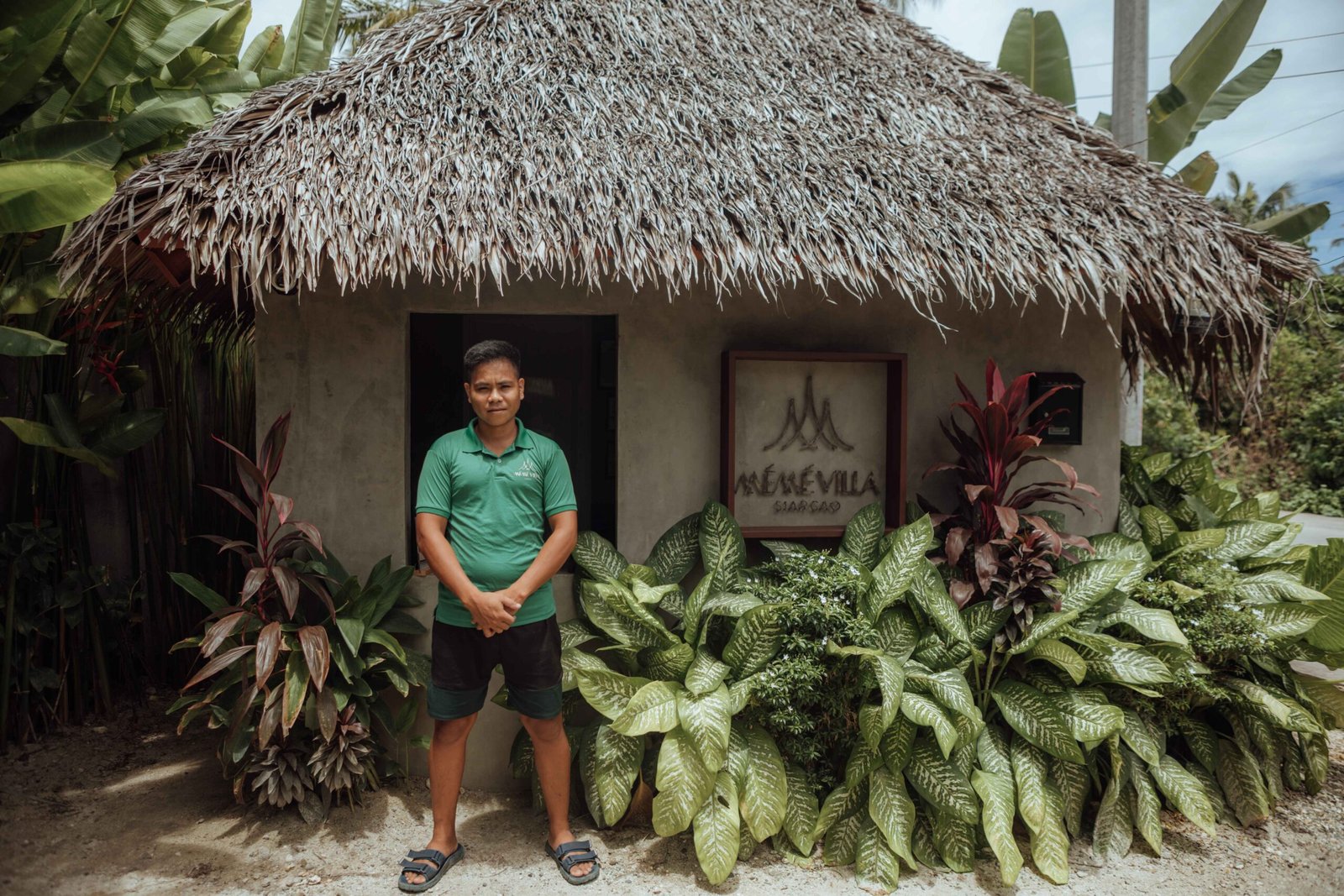

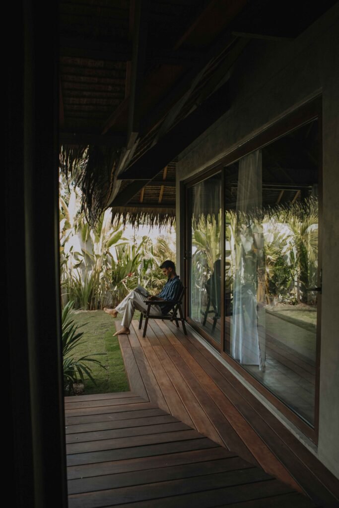
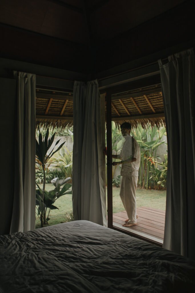
A Hidden Oasis of Modern Comfort and Island Charm
Just steps away from Siargao’s top restaurants, cafés, and bars. With private parking and 24/7 front desk and security, your safety and privacy are always a priority.
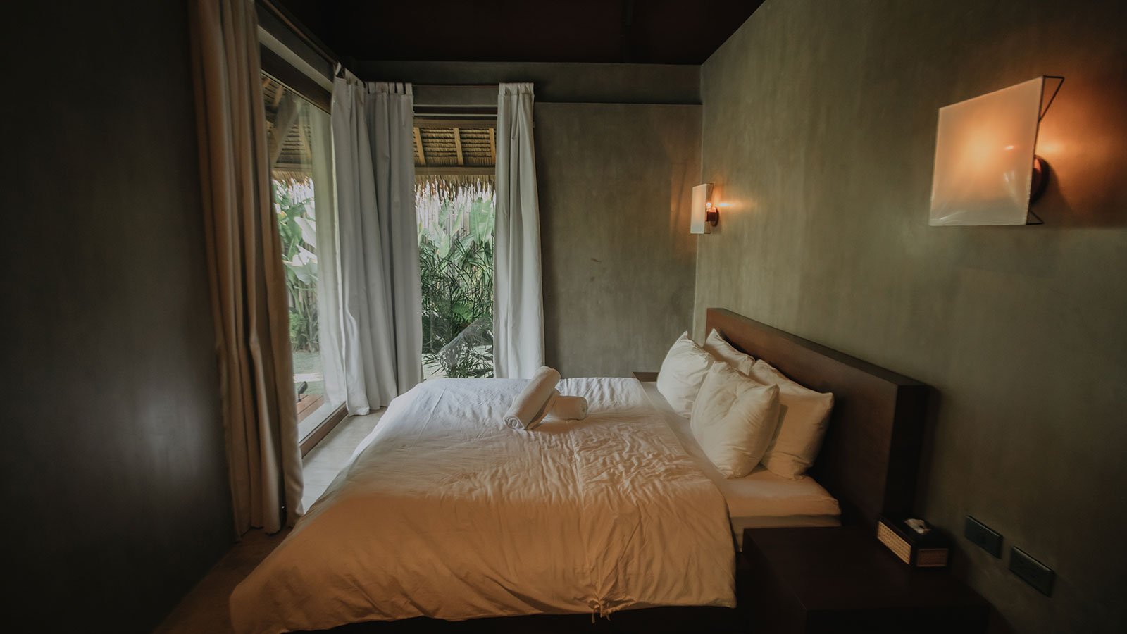
Private en-suite
Fully equipped
Premium appliances
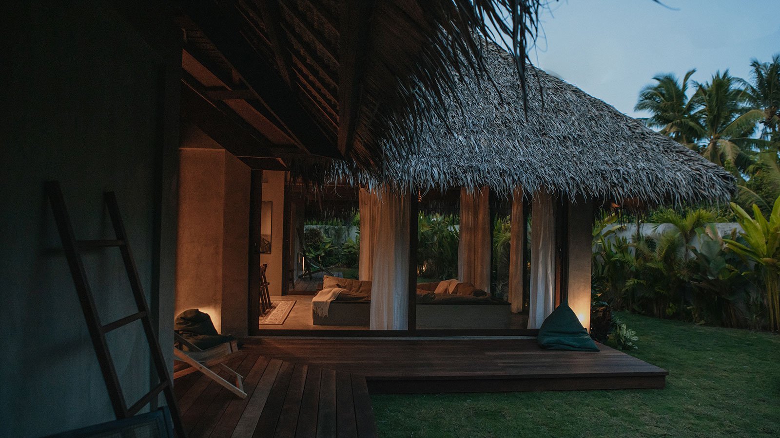
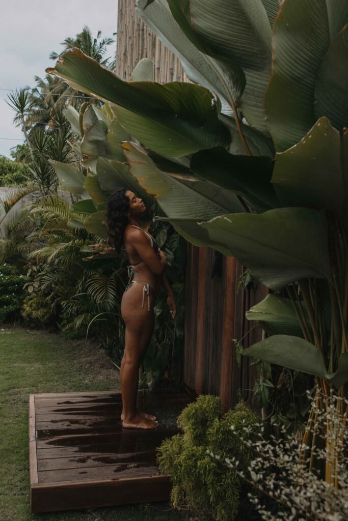
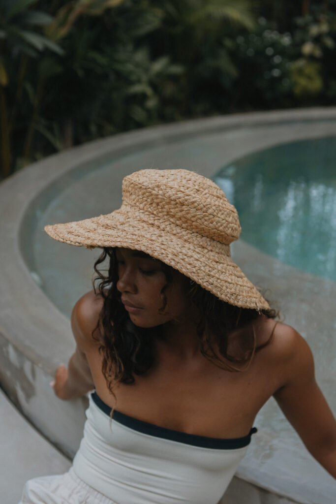
Tropical garden
Secure & free
Always available
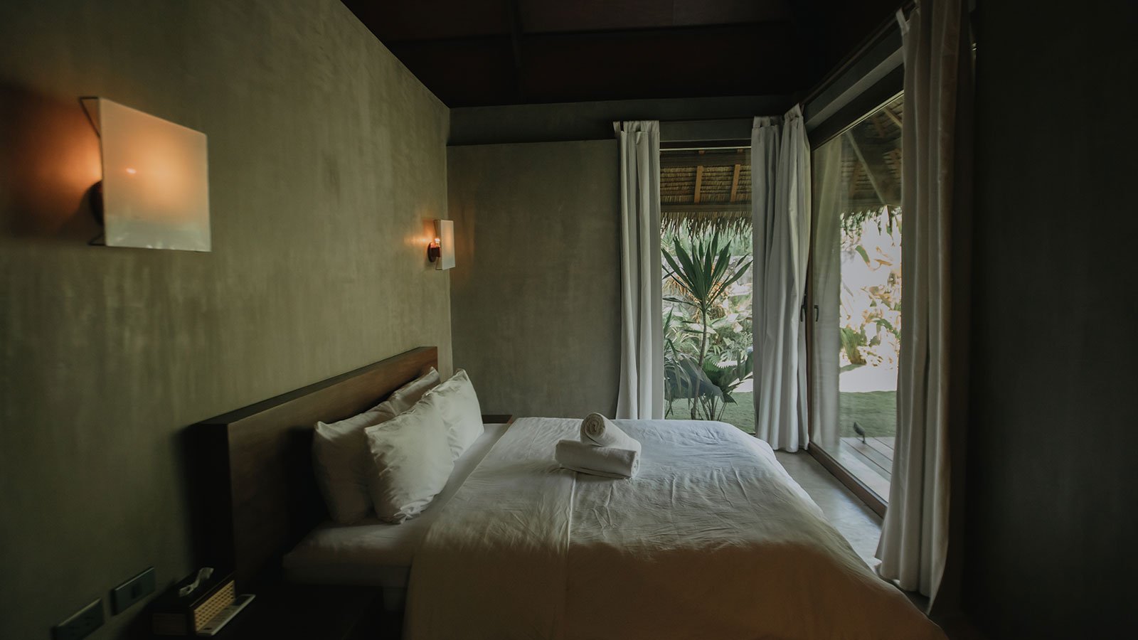
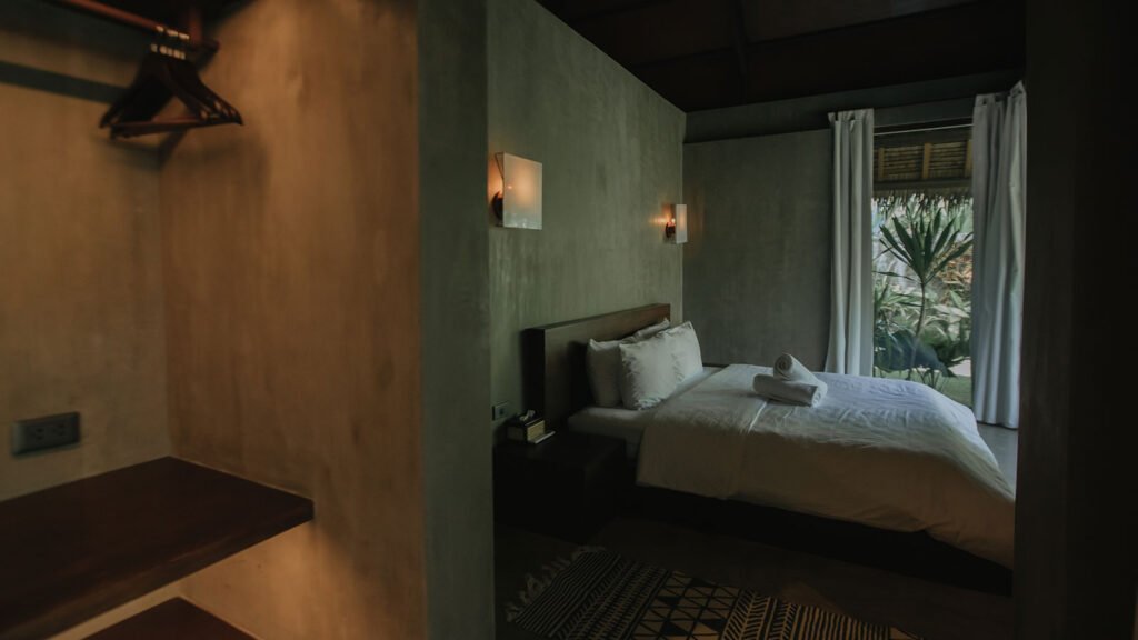
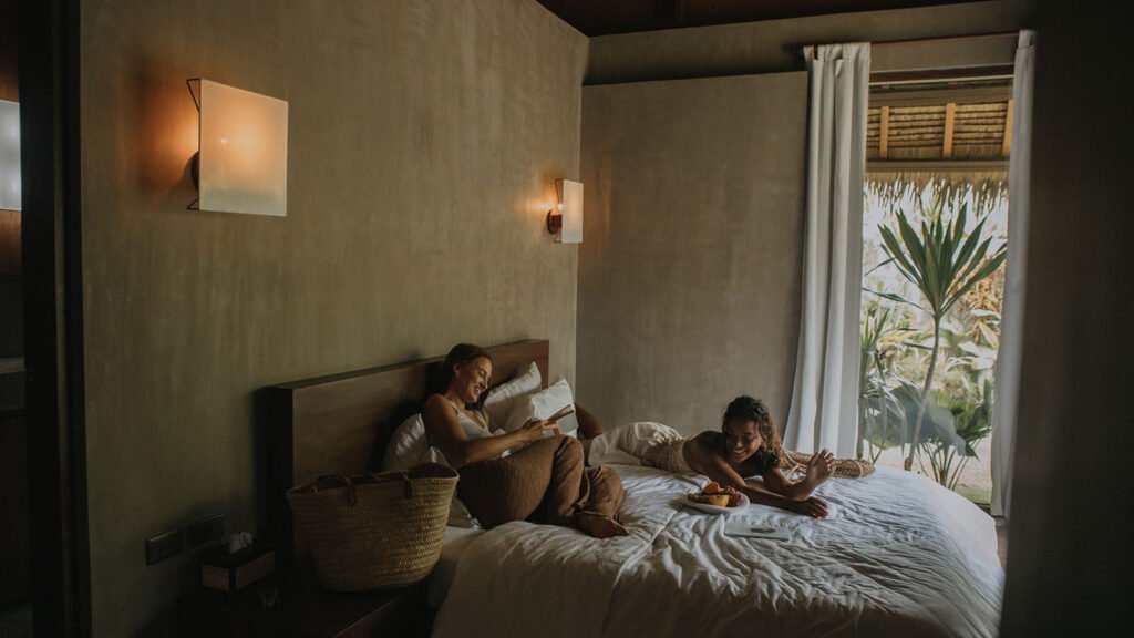
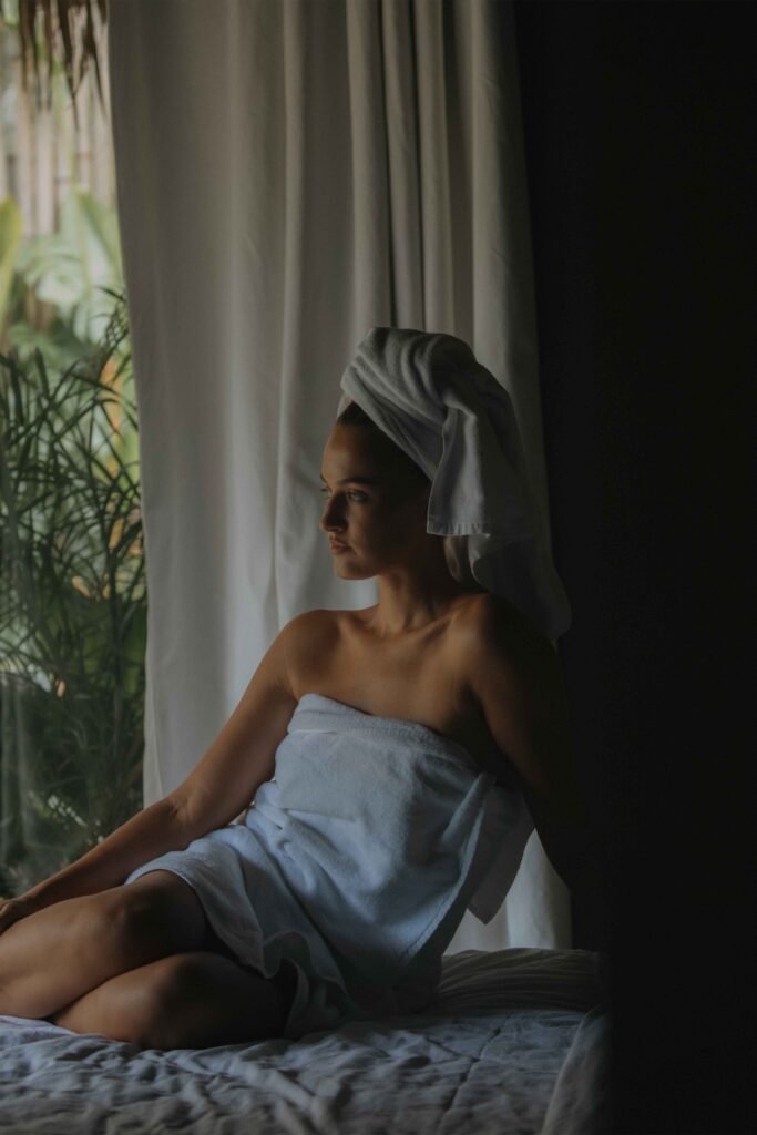
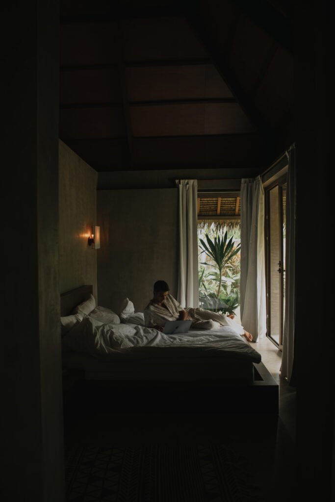
The villa features two bedrooms, each with a private bathroom and all essentials provided: towels, shampoo, bathrobes, hairdryer, and more.
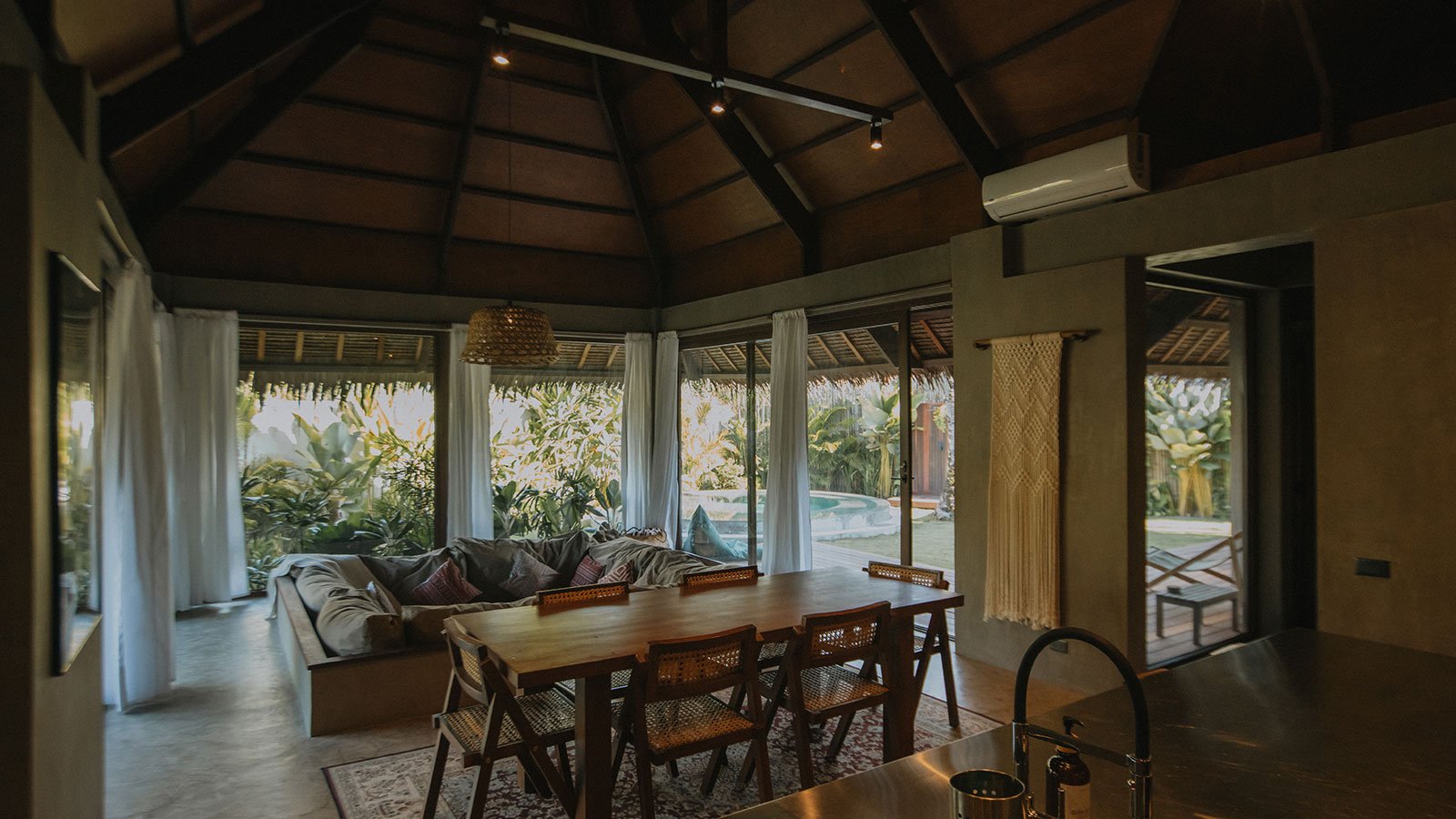
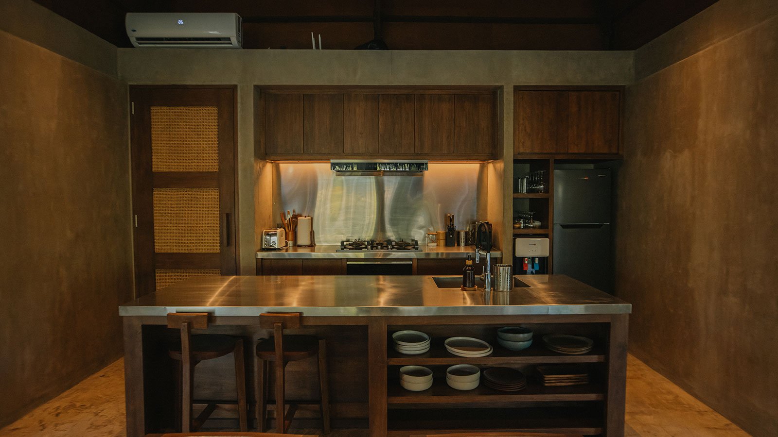
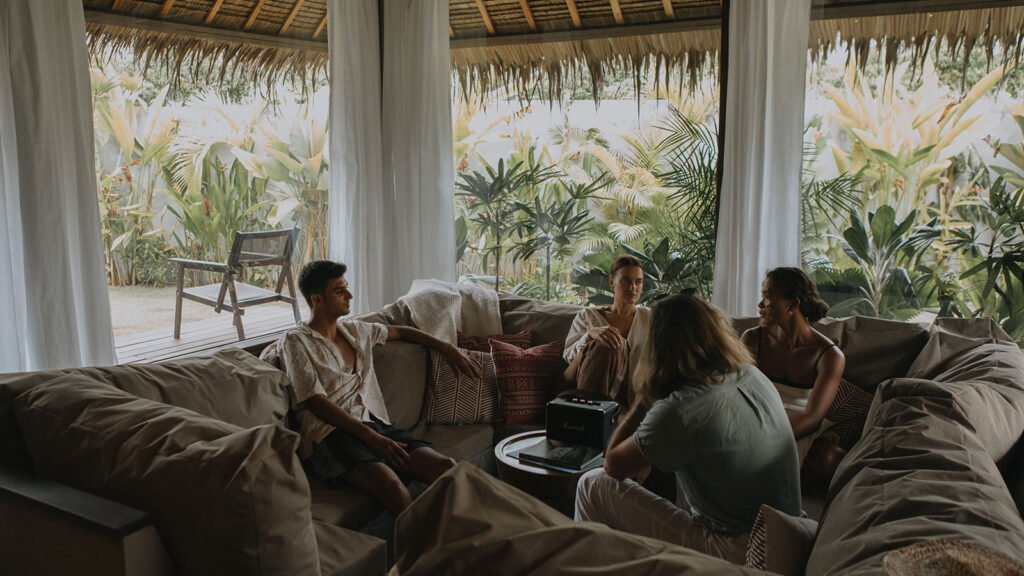
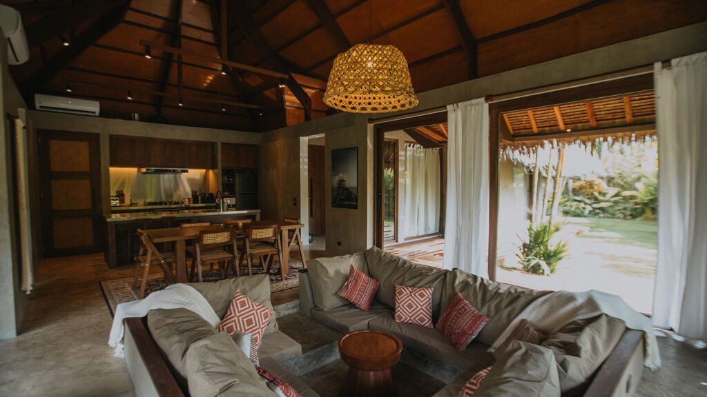
You'll enjoy a fully equipped kitchen with high-quality appliances, a spacious dining area, and a cozy sunken sofa, perfect for relaxing or sharing moments with loved ones.
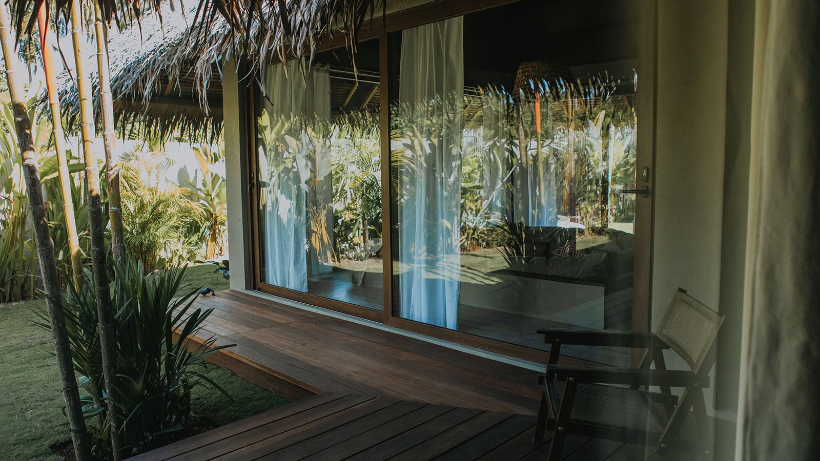
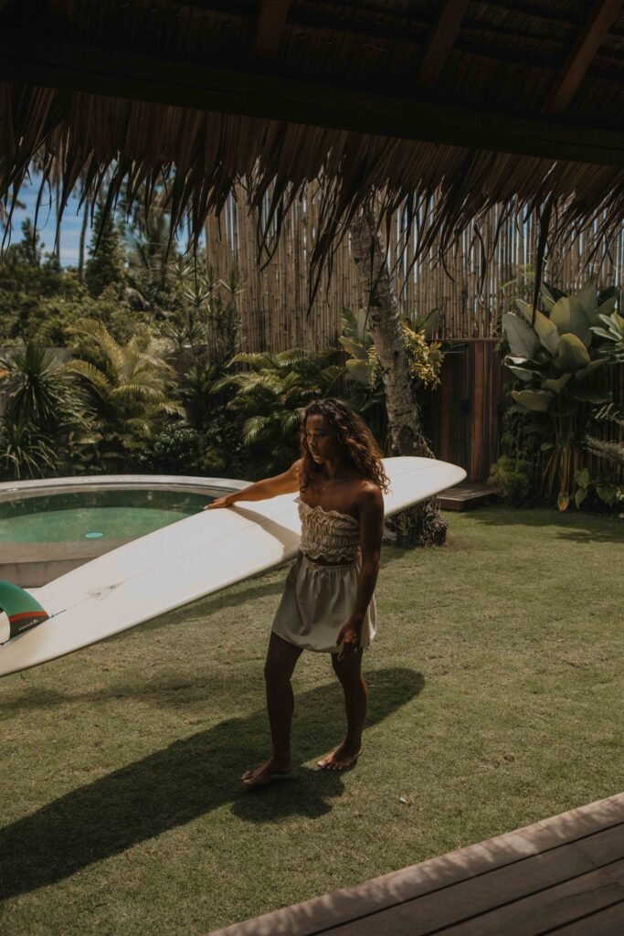
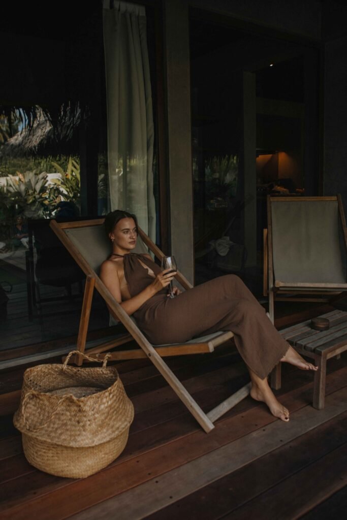
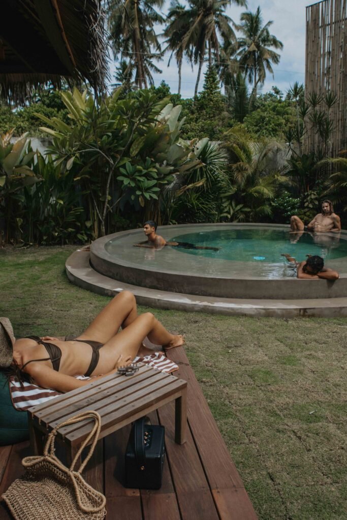
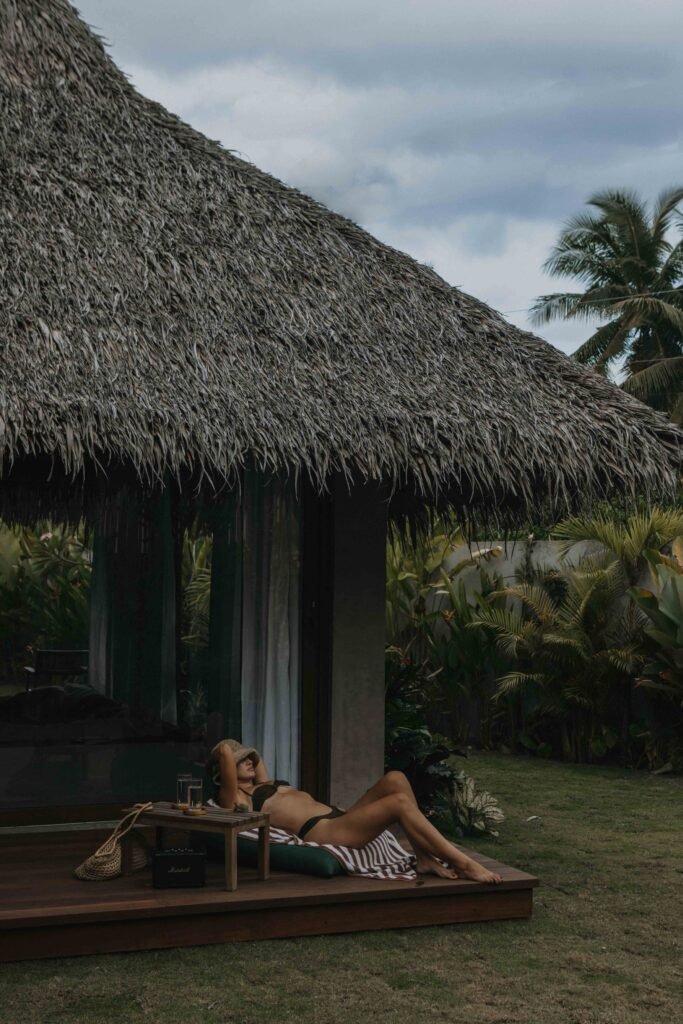
Outside, a private pool and large garden invite you to unwind, practice yoga at sunset, or simply enjoy the tropical surroundings.
And if you need anything, our team is always available at the front desk, day or night.
Your private island escape awaits. Book directly for the best rates.